“I tried to think of the most harmless thing. Something I loved from my childhood. Something that could never, ever possibly destroy us. Mr. Stay Puft.”
— Ray Venkman, Ghostbusters
It’s easy to understand why Ray from Ghostbusters, when trying to think of the safest thing he can, would think of something sweet to eat. Most folks like candy. Note that Ray, despite ostensibly having a PhD, did not think of his favorite statistics professor.
And that, of course, is why it’s such a good idea to mix candy with statistics. So often we want to introduce statistics with things that are practical, important and relevant. But these examples can also increase our fear. Data quality, millions of dollars at stake, medical instruments, it can all be a bit intimidating. But candy’s something safe you can use to build your confidence.
The data for quality analysis can be hard to collect, so collecting and recording your own will help you build your confidence. Counts are usually the easiest kind of data to get, and any kind of multi-colored candy works great. But count data is powerful too.
Let's get some count data and look at it with Minitab Statistical Software:
- At your favorite grocery store, buy a package of fun-size bags of M&M’s.
- Open a few bags and count the number of M&M’s of each color.
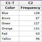
- In Minitab, record the number of M&M’s of each color like this:

There are lots of things we can do from here. Let’s start with a bar chart.
- In Minitab, choose Graph > Bar Chart.
- In Bars Represent, choose Values from a Table.
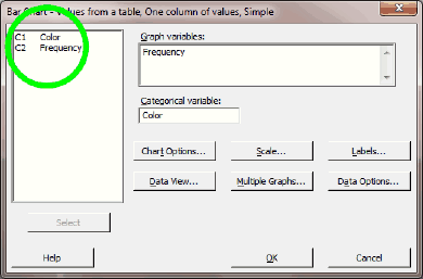
Leave Simple selected under One Column of Values. Click OK. - With your cursor in Graph Variables, double-click the column that has your numbers in it. In the image, I show where to click with the green circle. My column was called Frequency.
- With your cursor in Categorical Variable, double-click the column that has your categories in it. My column was called Color.
- Click Chart Options.
- In Order Main X Groups By, choose Decreasing Y. Click OK in both windows.
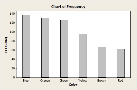
You’ll end up with something a bit like this:

In my case, the blue M&M’s were most frequent, and the red M&M’s were least common. And that's something that we often want to communicate with statistics: what's common and what's rare.
Have more than a few minutes? Check out M&M’s and statistics. I’ll share a few more of my favorite things to do with candy and statistics over the next few weeks. And what about you? What were your best experiences in the crossover between candy and statistics?


