


By Matthew Barsalou, guest blogger.
Many statistical tests assume the data being tested came from a normal distribution. Violating the assumption of normality can result in incorrect conclusions. For example, a Z test may indicate a new process is more efficient than an older process when this is not true. This could result in a capital investment for equipment that actually results in higher costs in the long run.
Statistical Process Control (SPC) requires either normally distributed data or a transformation must be performed on the data. It would be very risky to monitor a process with SPC charts created with data that violated the assumption of normality.
What can we do if the assumption of normality is critical to so many statistical methods? We can construct a probability plot to test this assumption.
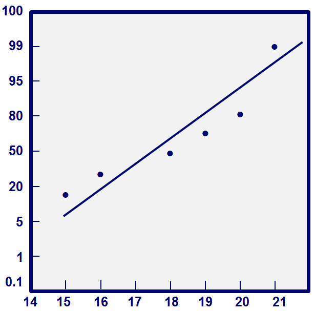
Those of us who are a bit old-fashioned can construct a probability plot by hand, by plotting the order values (j) against the observed cumulative frequency (j- 0.5/n). Using the numbers 16, 21, 20, 19, 18 and 15, we would construct a normal probability plot by first creating the table shown below.
| j |
Xj |
(j – 0.5)/6 |
| 1 |
15 |
0.158 |
| 2 |
16 |
0.325 |
| 3 |
18 |
0.492 |
| 4 |
19 |
0.658 |
| 5 |
20 |
0.825 |
| 6 |
21 |
0.992 |
We then plot the results as shown in the figure below.
That's fine for a small data set, but nobody wants to plot hundreds or thousands of data points by hand. Fortunately, we can also use Minitab Statistical Software to assess the normality of data. Minitab uses the Anderson-Darling test, which compares the actual distribution to a theoretical normal distribution. Anderson-Darling test’s null hypothesis is “The distribution is normal.”
Anderson-Darling test:
H0: The data follow a normal distribution.
Ha: The data don’t follow a normal distribution.
Test statistic: A2 = - N – S, where 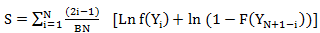 and F is the cumulative distribution function of the specified distribution. We can assess the results by looking at the resulting p value.
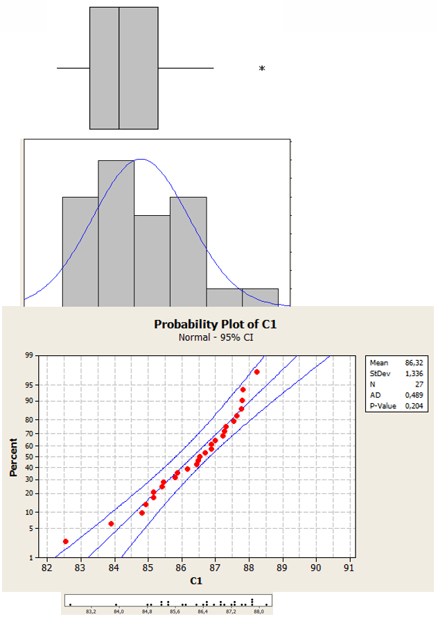
The figure below shows a normal distribution with a sample size of 27. The same data is shown in a histogram, probability plot, dot plot and a box blot.
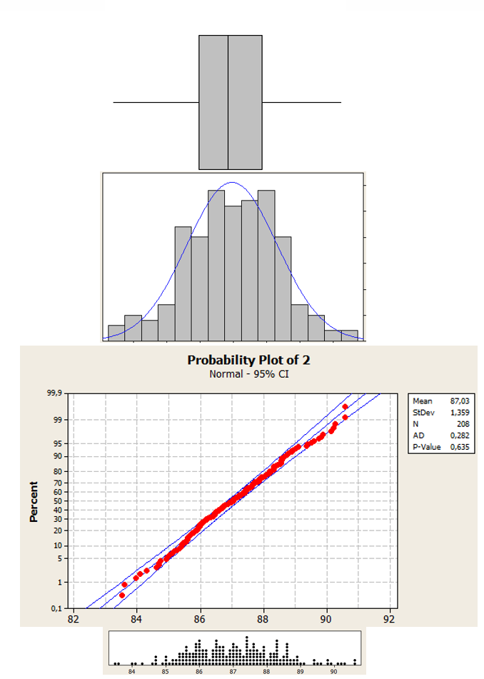
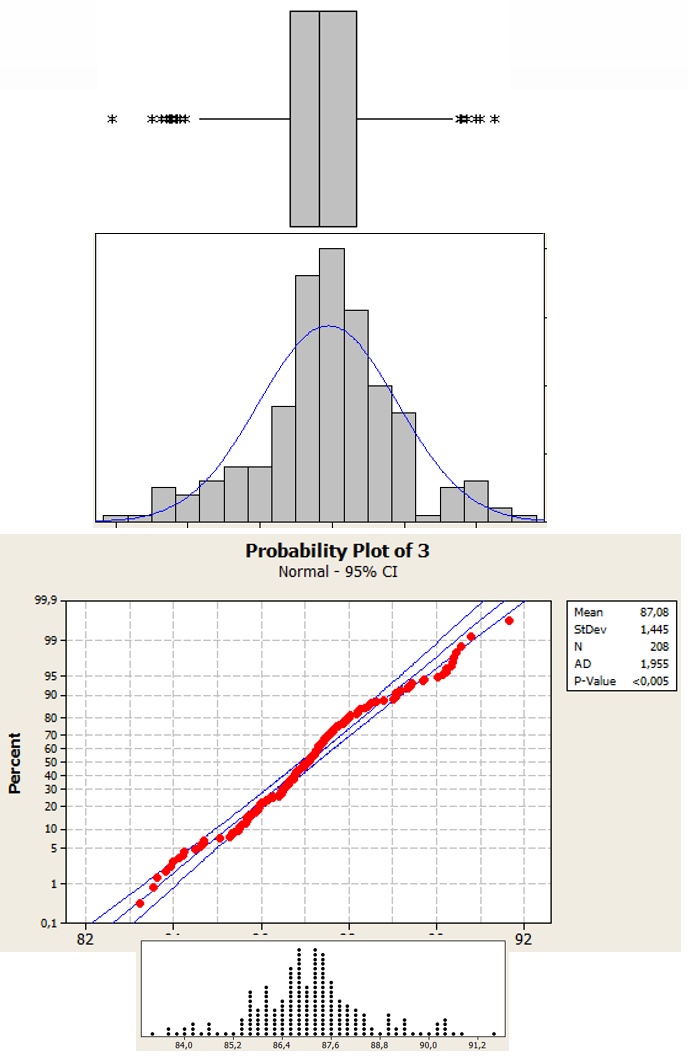
The next figure shows a normal distribution with sample a size of 208. Notice how the data is concentrated in the center of the histogram, probability plot, dot plot, and box plot.
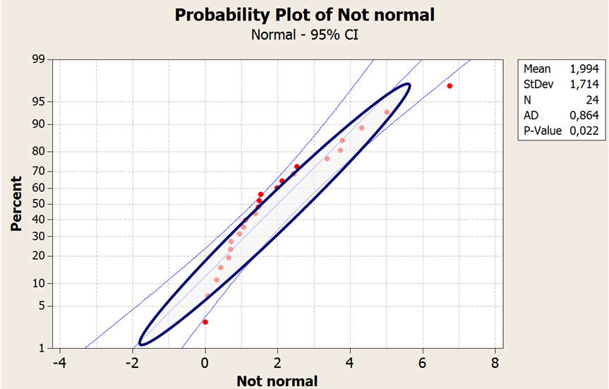
A Laplace distribution with a sample size of 208 is shown below. Visually, this data almost resembles a normal distribution; however, the Minitab generated P value of < 0.05 tells us that this distribution is not normally distributed.
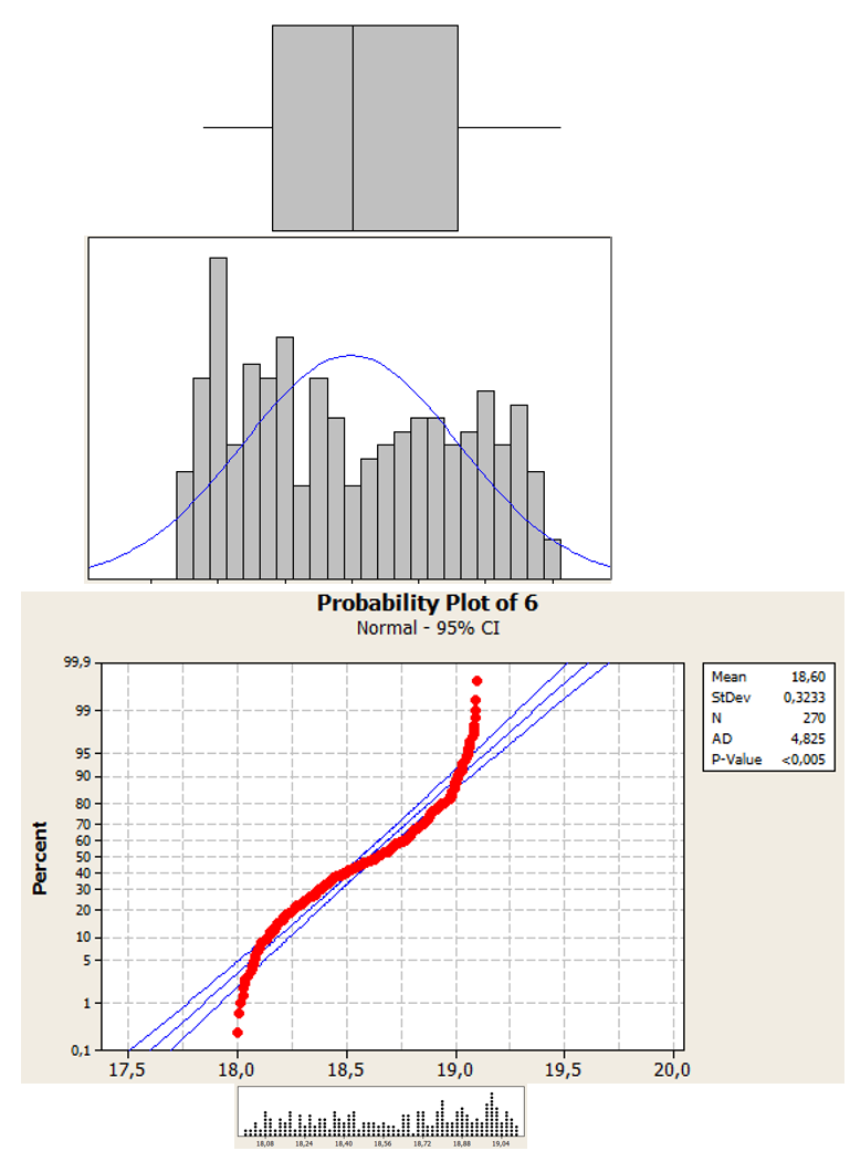
The figure below shows a uniform distribution with a sample size of 270. Even without looking at the P value we can quickly see that the data is not normally distributed.
Back in the days of hand-drawn probability plots, the “fat pencil test” was often used to evaluate normality. The data was plotted and the distribution was considered normal if all of the data points could be covered by a thick pencil. The fat pencil test was quick and easy. Unfortunately, it is not as accurate as the Anderson-Darling test and is not a substitution for an actual test.
Fat pencil test with normally distributed data
Fat pencil test with non-normally distributed data
The proper identification of a statistical distribution is critical for properly performing many types of hypothesis tests or for control charting. Fortunately, we can now asses our data without having to rely on hand-drawn tests and a large diameter pencil.
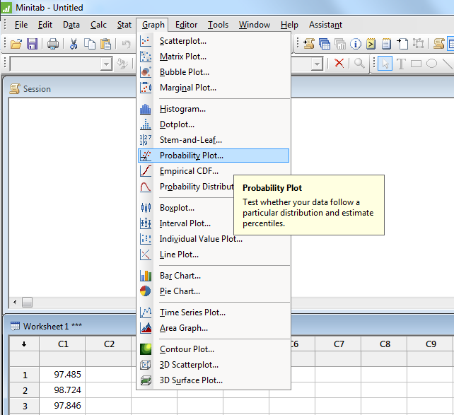
To test for normality go to the Graph menu in Minitab, and select Probability Plot.
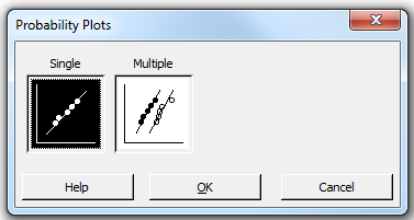
Click on OK to select Single if you are only looking at one column of data.
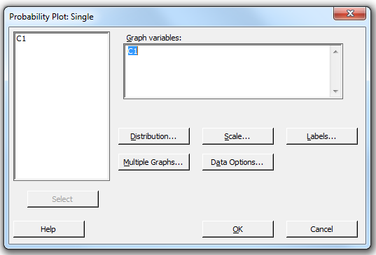
Select your column of data and then click OK.
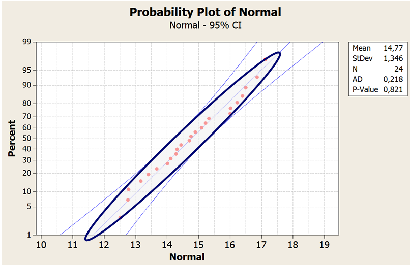
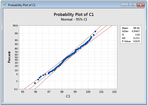
Minitab will generate a probability plot of your data. Notice the P-value below is 0.829. We would fail to reject the null hypothesis that the distribution of our data is equal to a normal distribution when we use a P-value of 0.05 for 95% confidence.
Using Minitab to test data for normality is far more reliable than a fat pencil test and generally quicker and easier. However, the fat pencil test may still be a viable option if you absolutely must analyze your data during a power outage.
About the Guest Blogger
Matthew Barsalou is a statistical problem resolution Master Black Belt at BorgWarner Turbo Systems Engineering GmbH. He is a Smarter Solutions certified Lean Six Sigma Master Black Belt, ASQ-certified Six Sigma Black Belt, quality engineer, and quality technician, and a TÜV-certified quality manager, quality management representative, and auditor. He has a bachelor of science in industrial sciences, a master of liberal studies with emphasis in international business, and has a master of science in business administration and engineering from the Wilhelm Büchner Hochschule in Darmstadt, Germany. He is author of the books Root Cause Analysis: A Step-By-Step Guide to Using the Right Tool at the Right Time, Statistics for Six Sigma Black Belts and The ASQ Pocket Guide to Statistics for Six Sigma Black Belts.