


A member of Minitab's LinkedIn group asked how to create a chart to monitor change by month, specifically comparing last year's data to this year's data. My last post showed how to do this using an Individuals Chart of the differences between this year's and last year's data. Here's another approach suggested by a participant in the group.
Applying Statistical Thinking
An individuals chart of the differences between this year's data and last year's might not be our best approach. Another approach is to look at all of the data together. We'll put this year's and last year's data into a single column and see how it looks in an individuals chart. (Want to play along? Here's my data set.)
We'll choose Stat > Control Charts > Variables Charts for Individuals > Individuals... and choose the "2 years" column in my datasheet as the variable. Minitab creates the following I chart:
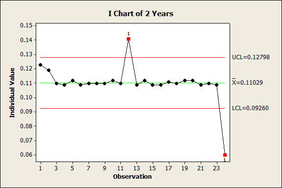
Now we can examine all of the data sequentially and ask some questions about it. Are there outliers? The data seem remarkably consistent, but those points in December (12 and 24) warrant more investigation as potential sources of special cause variation. If investigation revealed a source for these data points that indicate these outliers should be disregarded, these outliers could be removed from the calculations for the center line and control limits, or removed from the chart altogether.
What about seasonality, or a trend over the sequence? Neither issue affects this data set, but if they did, we could detrend or deseasonalize the data and chart the residuals to gain more insight into how the data are changing month-to-month.
I-MR Chart
Instead of an Individuals chart, one participant in the group suggested using an I-MR chart, which provides both the indiviudals chart and a moving-range chart. We can use the same single column of data, then examine the resulting I-MR chart for indications of special cause variation. "If not, there's no real reason to believe one year was different than another," this participant suggests.
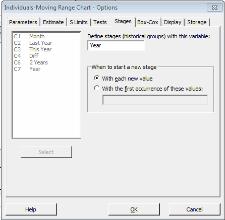
Another thing you can do with most of the control charts in Minitab is establish stages. For example, if we want to look for differences between years, we can add a column of data (call it "Year") to our worksheet that labels each data point by year (2012 or 2013). Now when we select Stat > Control Charts > Variables Charts for Individuals > I-MR...we will go into the Options dialog and select the Stages tab.
As shown above, we'll enter the "Year" column to define the stages. Minitab produces the following I-MR chart:
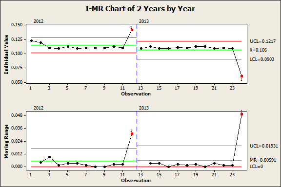
This I-MR chart displays the data in two distinct phases by year, so we can easily see if there are any points from 2013 that are outside the limits for 2012. That would indicate a significant difference. In this case, it looks like the only point outside the control limits for 2012 is that for December 2013, and we already know there's something we need to investigate for the December data.
Time Series Plot
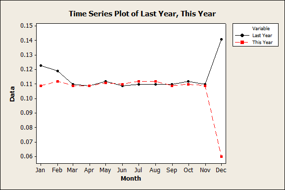
For the purposes of visual comparison, some members of the Minitab group on LinkedIn advocate the use of a time series plot. To create this graph, we'll need two columns in the data sheet, one for this year's data and one for last year's. Then we'll choose Graph > Time Series Plot > Multiple and select the "Last Year" and "This Year" columns for our series. Minitab gives us the following plot:
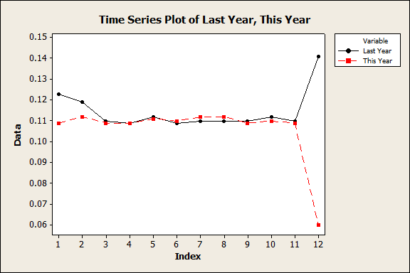
Because the plot of this year's and last year's data are shown in parallel, it's very easy to see where and by how much they differ over time.
Most of the months appear to be quite close for these data, but once again this graph gives us a dramatic visual representation of the difference between the December data points, not just as compared to the rest of the year, but compared to each other from last year to this.
Oh, and here's a neat Minitab trick: what if you'd rather have the Index values of 1, 2, 3...12 in the graph above appear as the names of the months? Very easy! Just double-click on the X axis, which brings up the Edit Scale dialog box. Click on the Time tab and fill it out as follows:
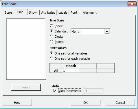
(Note that our data start with January, so we use 1 for our starting value. If your data started with the month of February, you'd choose to start with 2, etc.) Now we just click OK, and Minitab automatically updates the graph to include the names of the month:
The Value of Different Angles
One thing I see again and again on the Minitab LinkedIn group is how a simple question -- how can I look at change from month to month between years? -- can be approached from many different angles.
What's nice about using statistical software is that we have speed and power to quickly and easily follow up on all of these angles, and see what different things each approach can tell us about our data.