


Pareto charts are a special type of bar chart you can use to prioritize almost anything. This makes them very useful in making sound decisions. For example, if you have several possible quality improvement projects, but not enough time or people to do them all now, you can use a Pareto chart to identify which projects have the most potential for making meaningful improvement.
Pareto charts look somewhat similar to regular bar charts. In their simplest form, you collect counts (for different categories of defects, for example). Then each bar is ordered according to size or frequency, so you can determine which categories comprise the "vital few" that you should care about, and which are the "trivial many" and therefore less worthy of your attention.
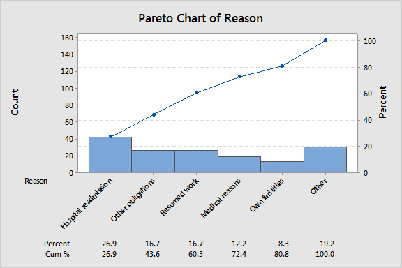
In the example below, taken from a Six Sigma healthcare project, you can see why Pareto charts are great for seeing where the largest gains might be made as you focus your improvement efforts.
Pareto charts are easy to understand and use. But, like any statistical tool, there are some things you need to keep in mind when you create and interpret the Pareto chart. Here are the top concerns to watch for so that you can get the most benefit from these simple but powerful tools.
- If you only collect data from a brief period of time, you may reach incorrect conclusions. This is particularly true if your process is unstable. When the process is not in control, the causes may be unstable and the vital few problems may change from week to week. So collecting data for a single day may truly reflect your whole process. If your data are not reliable, or aren't truly representative of your population, your Pareto chart will give you a distorted picture of the distribution of defects and causes.
- On the other hand, you don't want to collect data over too long a time period, either. Data collected during long periods of time may include changes that affect counts or frequencies, but shouldn't be included as causes. Check the data for stratification, or changes in the distribution of frequencies or counts over time.
- Select the categories you will measure carefully. If your initial Pareto analysis does not yield useful results, make sure that your categories are meaningful and that your "other" category is not too large.
- Weighted Pareto charts can be particularly useful in many situations. But weighting criteria need to be selected with care. For example, if the expense of certain defects are higher than others, cost may be a more meaningful basis for prioritization than number of occurrences.
- Be clear about your ultimate goal, and choose your focus appropriately. Focusing on the problems that happen most often should cut the amount of rework that needs to happen. But focusing on problems with the highest cost should maximize an improvement project's financial benefits.
- Use common sense. The purpose of a conducting a Pareto analysis is to identify where you might get the most "bang for your buck" in quality improvement, but you shouldn't ignore small, easily solved problems until all larger problems are solved.
Do you have any tips or suggestions for using Pareto charts effectively? Please share them in the comments!