


Ever make a task harder than it needs to be? Last night my son wanted to get a toy from a shelf in the closet that was a little beyond his reach. I watched as he tried to jump up and grab it. Next, he started climbing the shelves (a quick word from me stopped that approach). Then he tried jumping several more times. Finally he said "I give up."
That's when I suggested he use the stepladder, which had been just inside the closet the whole time.
Statistics can be like that. We can focus on the complexities of an analysis, but lose sight of the practical question we're trying to answer. If we step back and look at all of the available tools, sometimes there's a simpler way to get the information we need.
When seeking to improve quality, you often look for processes with unusual variation so you can identify what's causing the variation, then control it. A process is in control when only natural variation affects the output. That's the idea behind control charts, and Minitab makes it easy to create a wide variety of control charts depending on what type of data you're looking at.
But step back a second. Some variation is a natural part of any process, and in the quality world we're concerned only about that unusual, "special cause" variation. You can use a simple tool -- the run chart -- to see if special causes are influencing your process. A run chart can't tell you everything that a control chart can, but if a run chart suggests a process is already under control, perhaps you can find a process in more urgent need of improvement!
What Is a Run Chart?
A run chart displays how your process data changes over time, and can reveal evidence of special cause variation that creates recognizable patterns.
Minitab's run chart plots individual observations in the order they were collected, and draws a horizontal reference line at the median. Minitab also performs two tests that provide information on non-random variation due to trends, oscillation, mixtures, and clustering -- patterns that suggest the variation observed is due to special causes.
Creating a Run Chart
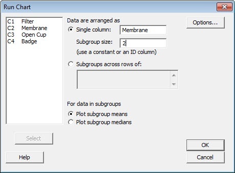
It's very easy to make a run chart in Minitab. Let's say you work for a company that makes radon detectors. To make sure that detectors using a certain kind of membrane measure the amount of radiation consistently, you test 20 devices (in groups of 2) in an experimental chamber. You record the amount of radiation each device measured after every test.
You decide to create a run chart as a first step in evaluating the variation in your measurements. (Want to follow along? Open the worksheet RADON.MTW included with Minitab's sample data sets.)
In Minitab, choose Stat > Quality Tools > Run Chart to bring up the dialog box below. When your data are in one column, enter the data column in Single column. In Subgroup size, enter a subgroup size or column of subgroup indicators. For this data, you enter "Membrane" in Single column, and enter "2" for Subgroup size.
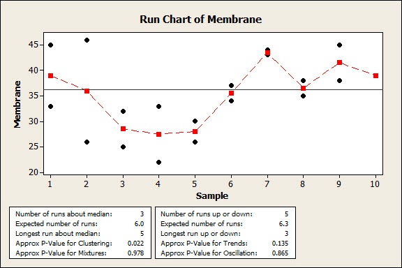
When you click OK, Minitab creates the following graph:
Interpreting the Run Chart
The black points on the run chart represent the individual values, while the red points connected with a line represent the subgroup means. Visually, it looks like there's some unusual variation happening for tests 3, 4, and 5. This is confirmed in the data for the normality tests: the p-values for mixtures, trends, and oscillation look fine, but the test for clustering is significant at the 0.05 level.
Because the p-value for the cluster test (p = 0.022) is less than the alpha value of 0.05, you can conclude that special causes are affecting your process, and you should investigate possible sources. Clusters can be evidence of sampling or measurement problems, but you'll need to collect more data to be sure.
In this case, the run chart detected unusual variation, so you'll need to dig deeper to find out what's going on with your data. But if the chart hadn't shown variation, you could be more confident about the accuracy of your membrane detectors and dedicate your time to improving a process that might be more problematic.
Either way, creating a run chart is a good, easy step to take toward the goal of eliminating special cause variation. It sure beats jumping and grabbing!