I love all data, whether it’s normally distributed or downright bizarre. However, many people are more comfortable with the symmetric, bell-shaped curve of a normal distribution. It is not as intuitive to understand a Gamma distribution, with its shape and scale parameters, as it is to understand the familiar Normal distribution with its mean and standard deviation.
However, it's a fact of life that not all data follow the Normal distribution. Hey, a lot of stuff is just abnormal...er...non-normally distributed. How to understand and present the practical implications of your non-normal distribution in an easy-to-understand manner is an ongoing challenge for analysts.
This is particularly true for quality process improvement analysts, because a lot of their data is skewed (non-symmetric). The output of many processes often have natural limits on one side of the distribution. Natural limits include things like purity, which can’t exceed 100%. Or drill hole sizes that cannot be smaller than the drill bit. These natural limits produce skewed distributions that extend away from the natural limit. So, non-normal data is actually typical in some areas.
Fear not; if you can shine the light on something and identify it, it makes it less scary. I will show you how to:
- Use Minitab Statistical Software to identify the distribution of your data (this post)
- Reap the benefits of the identification (next post)
To illustrate this process, I’ll look at the body fat percentage data from my previous post about using regression analysis for prediction. You can download this data here if you want to follow along.
Going with Raw Sample Data
We could simply plot the raw, sample data in a histogram like this one:
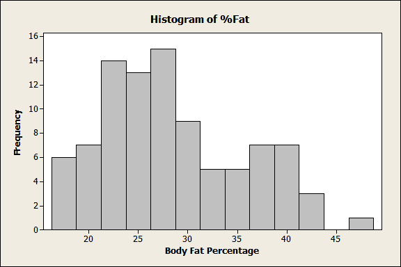
This histogram does show us the shape of the sample data and it is a good starting point. We can see that this distribution is skewed to the right and probably non-normal. However, this graph only tells us about the data from this specific example. You can’t make any inferences about the larger population.
What can be done to increase the usefulness of these data? First, identify the distribution that your data follow. Once you do that, you can learn things about the population—and you can create some cool-looking graphs!
How to Identify the Distribution of Your Data
To identify the distribution, we’ll go to Stat > Quality Tools > Individual Distribution Identification in Minitab. This handy tool allows you to easily compare how well your data fit 16 different distributions. It produces a lot of output both in the Session window and graphs, but don't be intimidated. Before we walk through the output, there are 3 measures you need to know.
Anderson-Darling statistic (AD): Lower AD values indicate a better fit. However, to compare how well different distributions fit the data, you should assess the p-value, as described below.
P-value: You want a high p-value. It’s generally valid to compare p-values between distributions and go with the highest. A low p-value (e.g., < 0.05) indicates that the data don’t follow that distribution. For some 3-parameter distributions, the p-value is impossible to calculate and is represented by asterisks.
LRT P: For 3-parameter distributions only, a low value indicates that adding the third parameter is a significant improvement over the 2-Parameter version. A higher value suggests that you may want to stick with the 2-Parameter version.
So, for my data, I’ll fill out the main dialog like this:
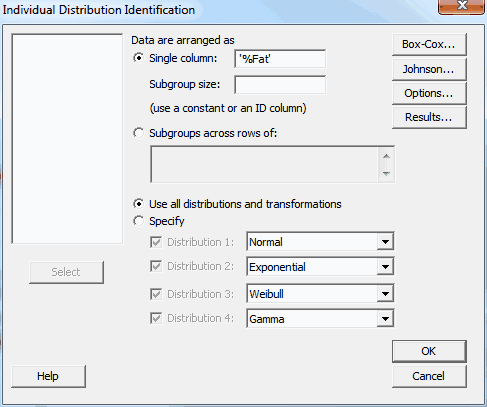
Let’s dive into the output. We’ll start with the Goodness of Fit Test table below.
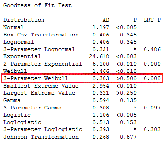
The very first line shows our data are definitely not normally distributed, because the p-value for Normal is less than 0.005!
We'll skip the two transformations (Box-Cox and Johnson) because we want to identify the native distribution rather than transform it.
A good place to start is to skim through the p-values and look for the highest. The highest p-value is for 3-Parameter Weibull. For the 3-Parameter Weibull, the LRT P is significant (0.000), which means that the third parameter significantly improves the fit.
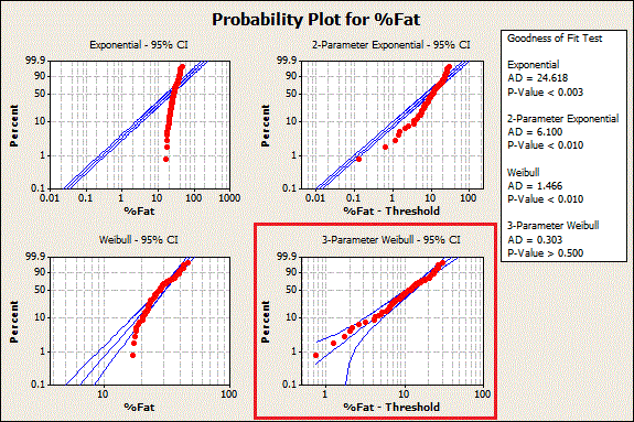
Given the higher p-value and significant LRT P value, we can pick the 3-Parameter Weibull distribution as the best fit for our data. We identified this distribution by looking at the table in the Session window, but Minitab also creates a series of graphs that provide most of the same information along with probability plots.
Probability plots are a great way to visually identify the distribution that your data follow. If the data points follow the straight line, the distribution fits. You can see 3-Parameter Weibull in the graph below, as well as three other distributions that don't fit the data.
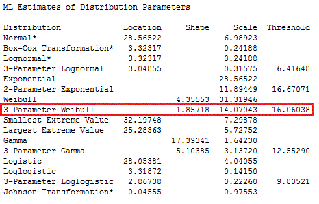
Now we know what the distribution is—but what are the distribution's parameter values? For those, look at the next table down in the Minitab Session window output:
How Does Identifying the Distribution of Data Help with Analysis?
All right. Now we know that the body fat percentage data follow a 3-Parameter Weibull distribution with a shape of 1.85718, a scale of 14.07043, and a threshold of 16.06038.
At this point you may be wondering, "How does that help us?" The answer: with this information about the distribution, we can go beyond the raw sample data and make statistical inferences about the larger population.
In my next post, I'll show you how to use powerful tools in Minitab to gain deeper insights into your research area and present your results more effectively.


