


In regression analysis, you'd like your regression model to have significant variables and to produce a high R-squared value. This low P value / high R2 combination indicates that changes in the predictors are related to changes in the response variable and that your model explains a lot of the response variability.
This combination seems to go together naturally. But what if your regression model has significant variables but explains little of the variability? It has low P values and a low R-squared.
At first glance, this combination doesn’t make sense. Are the significant predictors still meaningful? Let’s look into this!
Comparing Regression Models with Low and High R-squared Values
It’s difficult to understand this situation using numbers alone. Research shows that graphs are essential to correctly interpret regression analysis results. Comprehension is easier when you can see what is happening!
With this in mind, I'll use fitted line plots. However, a 2D fitted line plot can only display the results from simple regression, which has one predictor variable and the response. The concepts hold true for multiple linear regression, but I can’t graph the higher dimensions that are required.
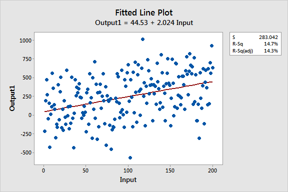
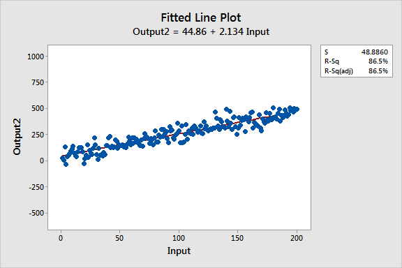
These fitted line plots display two regression models that have nearly identical regression equations, but the top model has a low R-squared value while the other one is high. I’ve kept the graph scales constant for easier comparison. Here are the data for these examples.
Similarities Between the Regression Models
The two models are nearly identical in several ways:
- Regression equations: Output = 44 + 2 * Input
- Input is significant with P < 0.001 for both models
You can see that the upward slope of both regression lines is about 2, and they accurately follow the trend that is present in both datasets.
The interpretation of the P value and coefficient for Input doesn’t change. If you move right on either line by increasing Input by one unit, there is an average two-unit increase in Output. For both models, the significant P value indicates that you can reject the null hypothesis that the coefficient equals zero (no effect).
Further, if you enter the same value for Input into both equations, you’ll calculate nearly equivalent predicted values for Output. For instance, an Input of 10 yields a predicted Output of 66.2 for one model and 64.8 for the other model.
Differences Between the Regression Models
I bet the main difference is the first thing you noticed about these fitted line plots: The variability of the data around the two regression lines is drastically different. R2 and S (standard error of the regression) numerically describe this variability.
The low R-squared graph shows that even noisy, high-variability data can have a significant trend. The trend indicates that the predictor variable still provides information about the response even though data points fall further from the regression line. Keep this graph in mind when you try to reconcile significant variables with a low R-squared value!
As we saw, the two regression equations produce nearly identical predictions. However, the differing levels of variability affect the precision of these predictions.
To assess the precision, we’ll look at prediction intervals. A prediction interval is a range that is likely to contain the response value of a single new observation given specified settings of the predictors in your model. Narrower intervals indicate more precise predictions. Below are the fitted values and prediction intervals for an Input of 10.
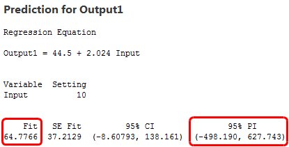

The model with the high variability data produces a prediction interval that extends from about -500 to 630, over 1100 units! Meanwhile, the low variability model has a prediction interval from -30 to 160, about 200 units. Clearly, the predictions are much more precise from the high R-squared model, even though the fitted values are nearly the same!
The difference in precision should make sense after seeing the variability present in the actual data. When the data points are spread out further, the predictions must reflect that added uncertainty.
Closing Thoughts
Let’s recap what we’ve learned:
- The coefficients estimate the trends while R-squared represents the scatter around the regression line.
- The interpretations of the significant variables are the same for both high and low R-squared models.
- Low R-squared values are problematic when you need precise predictions.
So, what’s to be done if you have significant predictors but a low R-squared value? I can hear some of you saying, "add more variables to the model!"
In some cases, it’s possible that additional predictors can increase the true explanatory power of the model. However, in other cases, the data contain an inherently higher amount of unexplainable variability. For example, many psychology studies have R-squared values less that 50% because people are fairly unpredictable.
To help determine which case applies to your regression model, read my post about avoiding the dangers of an overly complicated model.
The good news is that even when R-squared is low, low P values still indicate a real relationship between the significant predictors and the response variable.
If you're learning about regression, read my regression tutorial!