Regression analysis generates an equation to describe the statistical relationship between one or more predictor variables and the response variable. After you use Minitab Statistical Software to fit a regression model, and verify the fit by checking the residual plots, you’ll want to interpret the results. In this post, I’ll show you how to interpret the p-values and coefficients that appear in the output for linear regression analysis.
How Do I Interpret the P-Values in Linear Regression Analysis?
The p-value for each term tests the null hypothesis that the coefficient is equal to zero (no effect). A low p-value (< 0.05) indicates that you can reject the null hypothesis. In other words, a predictor that has a low p-value is likely to be a meaningful addition to your model because changes in the predictor's value are related to changes in the response variable.
Conversely, a larger (insignificant) p-value suggests that changes in the predictor are not associated with changes in the response.
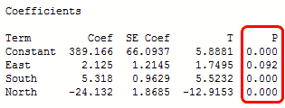
In the output below, we can see that the predictor variables of South and North are significant because both of their p-values are 0.000. However, the p-value for East (0.092) is greater than the common alpha level of 0.05, which indicates that it is not statistically significant.

Typically, you use the coefficient p-values to determine which terms to keep in the regression model. In the model above, we should consider removing East.
Related: F-test of overall significance
How Do I Interpret the Regression Coefficients for Linear Relationships?
Regression coefficients represent the mean change in the response variable for one unit of change in the predictor variable while holding other predictors in the model constant. This statistical control that regression provides is important because it isolates the role of one variable from all of the others in the model.
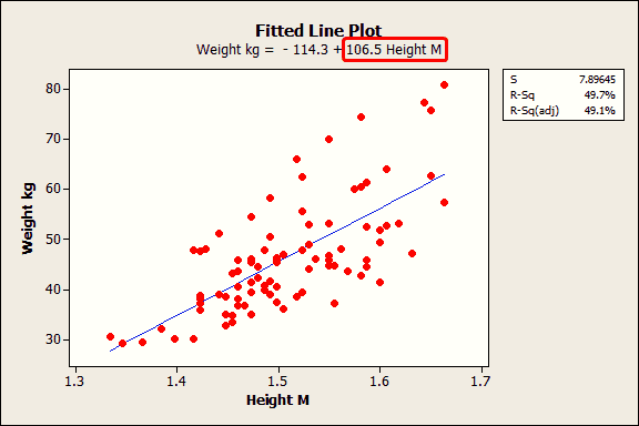
The key to understanding the coefficients is to think of them as slopes, and they’re often called slope coefficients. I’ll illustrate this in the fitted line plot below, where I’ll use a person’s height to model their weight. First, Minitab’s session window output:

The fitted line plot shows the same regression results graphically.

The equation shows that the coefficient for height in meters is 106.5 kilograms. The coefficient indicates that for every additional meter in height you can expect weight to increase by an average of 106.5 kilograms.
The blue fitted line graphically shows the same information. If you move left or right along the x-axis by an amount that represents a one meter change in height, the fitted line rises or falls by 106.5 kilograms. However, these heights are from middle-school aged girls and range from 1.3 m to 1.7 m. The relationship is only valid within this data range, so we would not actually shift up or down the line by a full meter in this case.
If the fitted line was flat (a slope coefficient of zero), the expected value for weight would not change no matter how far up and down the line you go. So, a low p-value suggests that the slope is not zero, which in turn suggests that changes in the predictor variable are associated with changes in the response variable.
I used a fitted line plot because it really brings the math to life. However, fitted line plots can only display the results from simple regression, which is one predictor variable and the response. The concepts hold true for multiple linear regression, but I would need an extra spatial dimension for each additional predictor to plot the results. That's hard to show with today's technology!
How Do I Interpret the Regression Coefficients for Curvilinear Relationships and Interaction Terms?
In the above example, height is a linear effect; the slope is constant, which indicates that the effect is also constant along the entire fitted line. However, if your model requires polynomial or interaction terms, the interpretation is a bit less intuitive.
As a refresher, polynomial terms model curvature in the data, while interaction terms indicate that the effect of one predictor depends on the value of another predictor.
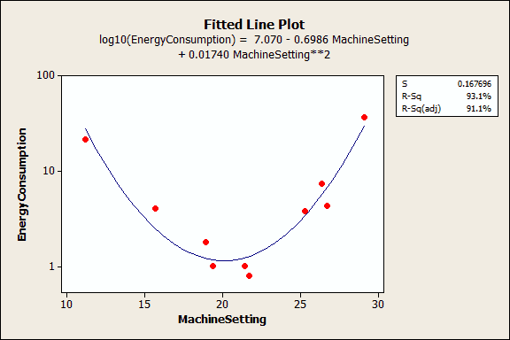
The next example uses a data set that requires a quadratic (squared) term to model the curvature. In the output below, we see that the p-values for both the linear and quadratic terms are significant.

The residual plots (not shown) indicate a good fit, so we can proceed with the interpretation. But, how do we interpret these coefficients? It really helps to graph it in a fitted line plot.

You can see how the relationship between the machine setting and energy consumption varies depending on where you start on the fitted line. For example, if you start at a machine setting of 12 and increase the setting by 1, you’d expect energy consumption to decrease. However, if you start at 25, an increase of 1 should increase energy consumption. And if you’re around 20, energy consumption shouldn’t change much at all.
A significant polynomial term can make the interpretation less intuitive because the effect of changing the predictor varies depending on the value of that predictor. Similarly, a significant interaction term indicates that the effect of the predictor varies depending on the value of a different predictor.
Take extra care when you interpret a regression model that contains these types of terms. You can’t just look at the main effect (linear term) and understand what is happening! Unfortunately, if you are performing multiple regression analysis, you won't be able to use a fitted line plot to graphically interpret the results. This is where subject area knowledge is extra valuable!
Particularly attentive readers may have noticed that I didn’t tell you how to interpret the constant. I’ll cover that in my next post!
Be sure to:
If you're learning about regression, read my regression tutorial!


