


Here is a scenario involving process capability that we’ve seen from time to time in Minitab's technical support department. I’m sharing the details in this post so that you’ll know where to look if you encounter a similar situation.
You need to run a capability analysis. You generate the output using Minitab Statistical Software. When you look at the results, the Cpk is huge and the histogram in the output looks strange:

What’s going on here? The Cpk seems unrealistic at 42.68, the "within" fit line is tall and narrow, and the bars on the histogram are all smashed down. Yet if we use the exact same data to make a histogram using the Graph menu, we see that things don’t look so bad:

So what explains the odd output for the capability analysis?
Notice that the ‘within subgroup’ variation in the capability output is represented by the tall dashed line in the middle of the histogram. This is the StDev (Within) shown on the left side of the graph. The within subgroup variation of 0.0777 is very small relative to the overall standard deviation.
So what is causing the within subgroup variation to be so small? Another graph in Minitab can give us the answer: The Capability Sixpack. In the case above, the subgroup size was 1 and Minitab’s Capability Sixpack in Stat > Quality Tools > Capability Sixpack > Normal will plot the data on a control chart for individual observations, an I-chart:

Hmmm...this could be why, in Minitab training, our instructors recommend using the Capability Sixpack first.
In the Capability Sixpack above, we can see that the individually plotted values on the I-chart show an upward trend, and it appears that the process is not stable and in control (as it should be for data used in a capability analysis). A closer look at the data in the worksheet clearly reveals that the data was sorted in ascending order:

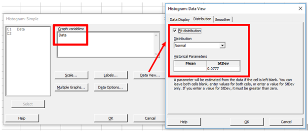
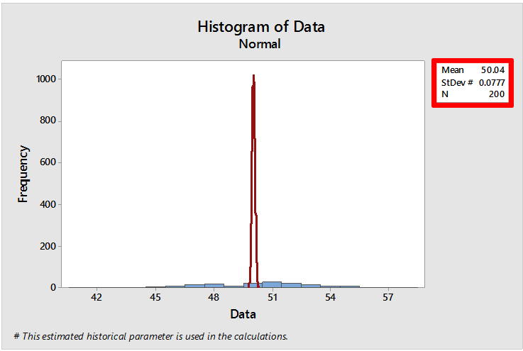
Because the within-subgroup variation for data not collected in subgroups is estimated based on the moving ranges (average of the distance between consecutive points), sorting the data causes the within-subgroup variation to be very small. With very little within-subgroup variation we see a very tall, narrow fit line that represents the within subgroup variation, and that is ‘smashing down’ the bars on the histogram. We can see this by creating a histogram in the Graph menu and forcing Minitab to use a very small standard deviation (by default this graph uses the overall standard deviation that is used when calculating Ppk): Graph > Histogram > Simple, enter the data, click Data View, choose the Distribution tab, check Fit distribution and for the Historical StDev enter 0.0777, then click OK and now we get:
Mystery solved! And if you still don’t believe me, we can get a better looking capability histogram by randomizing the data first (Calc > Random Data > Sample From Columns):

Now if we run the capability analysis using the randomized data in C2 we see:

A note of caution: I’m not suggesting that the data for a capability analysis should be randomized. The moral of the story is that the data in the worksheet should be entered in the order it was collected so that it is representative of the normal variation in the process (i.e., the data should not be sorted).
Too bad our Cpk doesn’t look as amazing as it did before…now it's time to get to work with Minitab to improve our Cpk!