


Master the 7 basic tools quality professionals, engineers, and manufacturing teams should know to solve quality issues, improve processes, and make better decisions.
They help organizations identify root causes, analyze variation, monitor processes, and improve quality. These seven are among the most used quality improvement tools in manufacturing, quality management, and Six Sigma initiatives.
The 7 tools include:
- Fishbone Diagrams
- Control Charts
- Histograms
- Process Maps
- Pareto Charts
- Run Charts
- Scatter Plots
These tools may have been around for a while, but they are as useful as ever!
The best part about these tools is their simplicity, and how quickly they work in Minitab Statistical Software or Engage.
1. WHAT IS A Fishbone Diagram?
Fishbones, or cause-and-effect diagrams, help you brainstorm and see the relationships between potential roots of a problem. This diagram is one of the most commonly used root cause analysis tools in quality improvement projects. The fishbone below identifies the potential causes of delayed lab results:
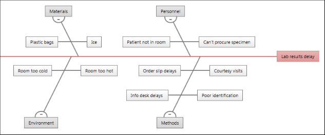
On a fishbone diagram, the central problem—or effect—is on the far right. Affinities, which are categories of causes, branch from the spine of the central effect. The brainstormed causes branch from the affinities.
When to Use a Fishbone Diagram: Finding Root Causes
2. WHAT IS A Control Chart?
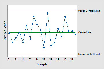
Control charts are used to monitor the stability of processes and can turn time-ordered data for a particular characteristic—such as product weight or hold time at a call center—into a picture that is easy to understand. These charts indicate when there are points out of control or unusual shifts in a process.
When to Use a Control Chart: Monitoring Process Stability
Learn how engineers use Minitab Real-Time SPC and control charts to monitor process quality continuously.

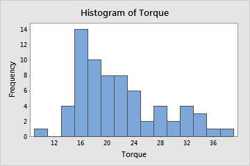
3. WHAT IS A Histogram?
Histograms are valuable quality management tools for understanding variation in a process. You can use a histogram to evaluate the shape and central tendency of your data, and to assess whether or not your data follow a specific distribution, such as the normal distribution.
Bars represent the number of observations falling within consecutive intervals. Because each bar represents many observations, a histogram is most useful when you have a large amount of data.
When to Use a Histogram: Visualizing Data Distribution
4. WHAT IS A Process Map?
A process map, sometimes called a flow chart, can be used to help you model your process and understand and communicate all activities in the process, the relationships between inputs and outputs, and key decision points. It is an essential improvement tool that helps teams visualize workflows and identify inefficiencies.
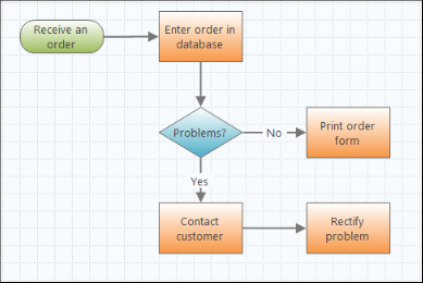
Engage makes it easy to construct high-level or detailed flow charts, featuring a functionality to assign variables to each shape and then share them with other tools you’re using in Engage.
When to Use a Process Map: Visualizing Workflows
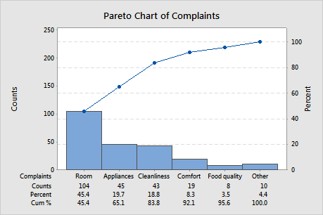
5. What is a Pareto Chart?
Pareto charts can help you prioritize quality problems and separate the “vital few” problems from the “trivial many” by plotting the frequencies and corresponding percentages of a categorical variable, which shows you where to focus your efforts and resources.
When to Use a Pareto Chart: Prioritizing Quality Problems
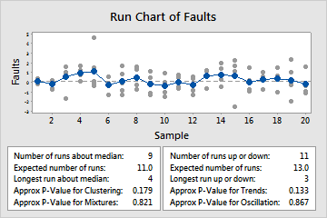
6. what is a Run Chart?
You can use a run chart to display how your process data changes over time, which can reveal evidence of special cause variation that creates recognizable patterns, trends, and shifts.
Minitab's run chart plots individual observations in the order they were collected and draws a horizontal reference line at the median. Minitab also performs two tests that provide information on non-random variation due to trends, oscillation, mixtures, and clustering—patterns that suggest the variation observed is due to special causes.
When to Use a Run Chart: Tracking Changes Over Time
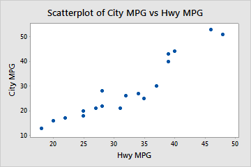
7. what is a Scatter Plot?
You can use a scatter plot to illustrate the relationship between two variables by plotting one against the other. Scatterplots are also useful for plotting a variable over time, making it a powerful tool for identifying patterns, correlations, clusters, and outliers in datasets.
When to Use a Scatter Plot: Studying Relationships
These seven basic tools remain some of the most effective process improvement instruments available today. Whether you're working in manufacturing, healthcare, engineering, or quality management, they provide a practical framework for identifying problems, performing root cause analyses, and driving continuous improvement.
No matter the industry, these are great tools to keep in your back pocket!
Start your Minitab Solution Center free trial and experience these quality improvement tools in action.
