Have you ever finished collecting data and wondered what you should do next? I’ve found that graphing data right away can give valuable insight and direction. Individual value plots in Minitab can help you view important features of your data, find any miscoded values, and identify unusual causes.
Here are three ways individual value plots can you help you to set the appropriate course for your analysis:
1. Identify Possible Outliers
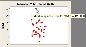
You can use individual value plots to identify possible outliers and other values of interest. Hover the cursor over any point to see its exact value and position in the worksheet.

Individual value plots can also clearly illustrate characteristics of the data distribution. In the graph above, most values are in a cluster between 4 and 10. Minitab can jitter (randomly nudge) the points horizontally, so that one value doesn’t obscure another. You can edit the plot to turn on or turn off jitter.
2. Make Group Comparisons
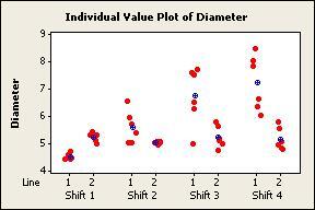
Because individual value plots display all values for all groups at the same time, they are especially helpful when you compare variables, groups, and even subgroups.

This plot shows the diameter of pipes from two lines over four shifts. You can see that the diameters of pipes produced by Line 1 seem to increase in variability across shifts, while the diameters of pipes from Line 2 appear more stable.
3. Support Other Analyses
An individual value plot is one of the built-in graphs that are available with many statistical analyses in Minitab. You can easily display an individual value plot while you perform these analyses. In the analysis dialog box, simply click Graphs and check Individual Value Plot.
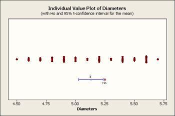
Some built-in individual value plots include specific analysis information. For example, the plot that accompanies a 1-sample t-test displays the 95% confidence interval for the mean and the reference value for the null hypothesis mean. These plots give you a graphical representation of the analysis results.
The plot below accompanies a 1-sample t-test, and all of the data values are between 4.5 and 5.75. The reference mean lies outside of the confidence interval, which suggests that the population mean differs from the hypothesized value:

For more on individual value plots, check out Minitab Help (Help > Help in the software).
Also, Patrick Runkel did a comical post a few months back that features individual value plots for visualizing stone skips: http://blog.minitab.com/blog/statistics-and-quality-data-analysis/graphical-analysis-visualizing-stone-skips-on-water.


