Often, when we start analyzing new data, one of the very first things we look at is whether certain pairs of variables are correlated. Correlation can tell if two variables have a linear relationship, and the strength of that relationship. This makes sense as a starting point, since we're usually looking for relationships and correlation is an easy way to get a quick handle on the data set we're working with.
What Is Correlation?
How do we define correlation? We can think of it in terms of a simple question: when X increases, what does Y tend to do? In general, if Y tends to increase along with X, there's a positive relationship. If Y decreases as X increases, that's a negative relationship.
Correlation is defined numerically by a correlation coefficient. This is a value that takes a range from -1 to 1. A coefficient of -1 is perfect negative linear correlation: a straight line trending downward. A +1 coefficient is, conversely, perfect positive linear correlation. A correlation of 0 is no linear correlation at all.
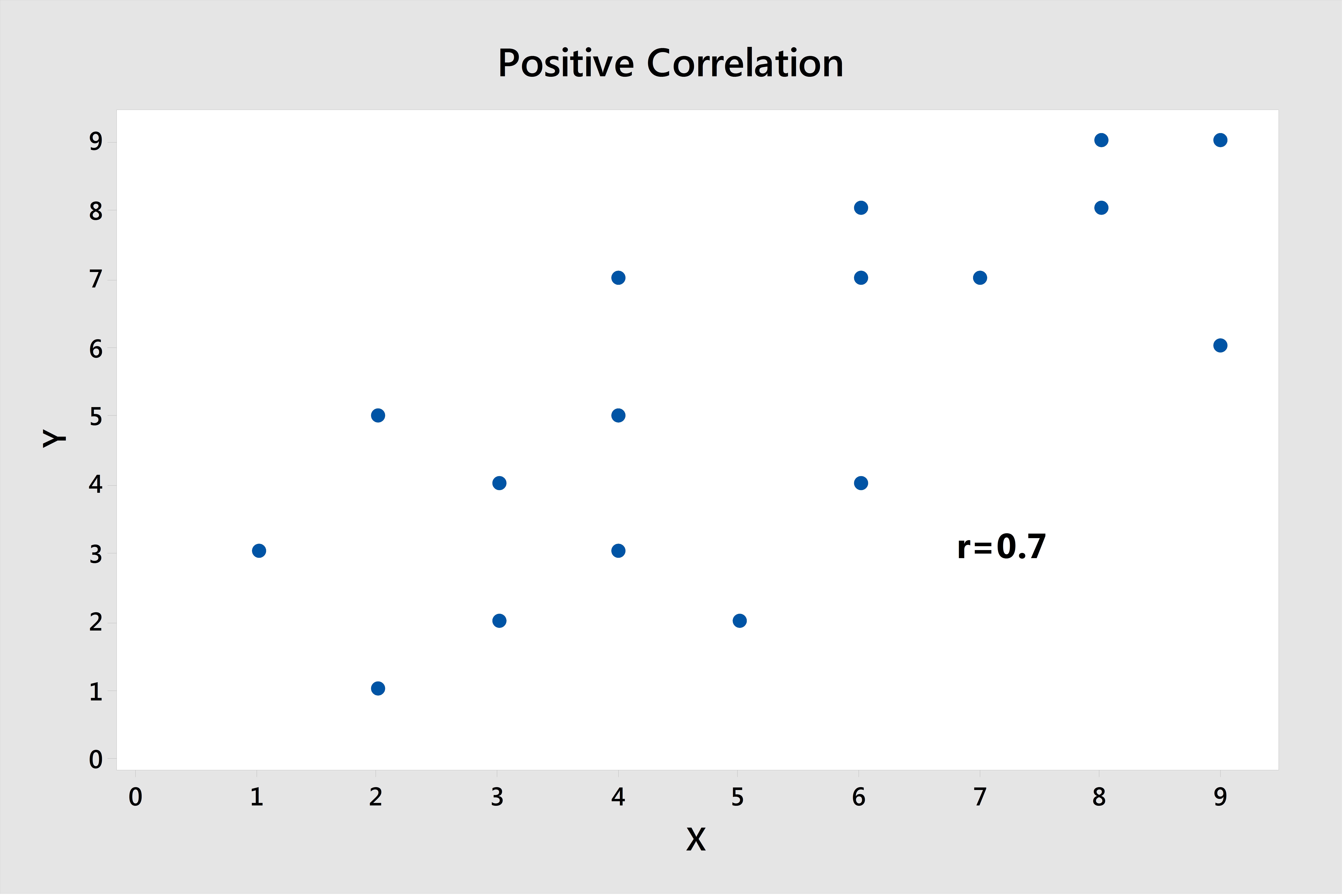
Making a scatterplot in Minitab can give you a quick visualization of the correlation between variables, and you can get the correlation coefficient by going to Stat > Basic Statistics > Correlation... Here's a few examples of data sets that a correlation coefficient can accurately assess.

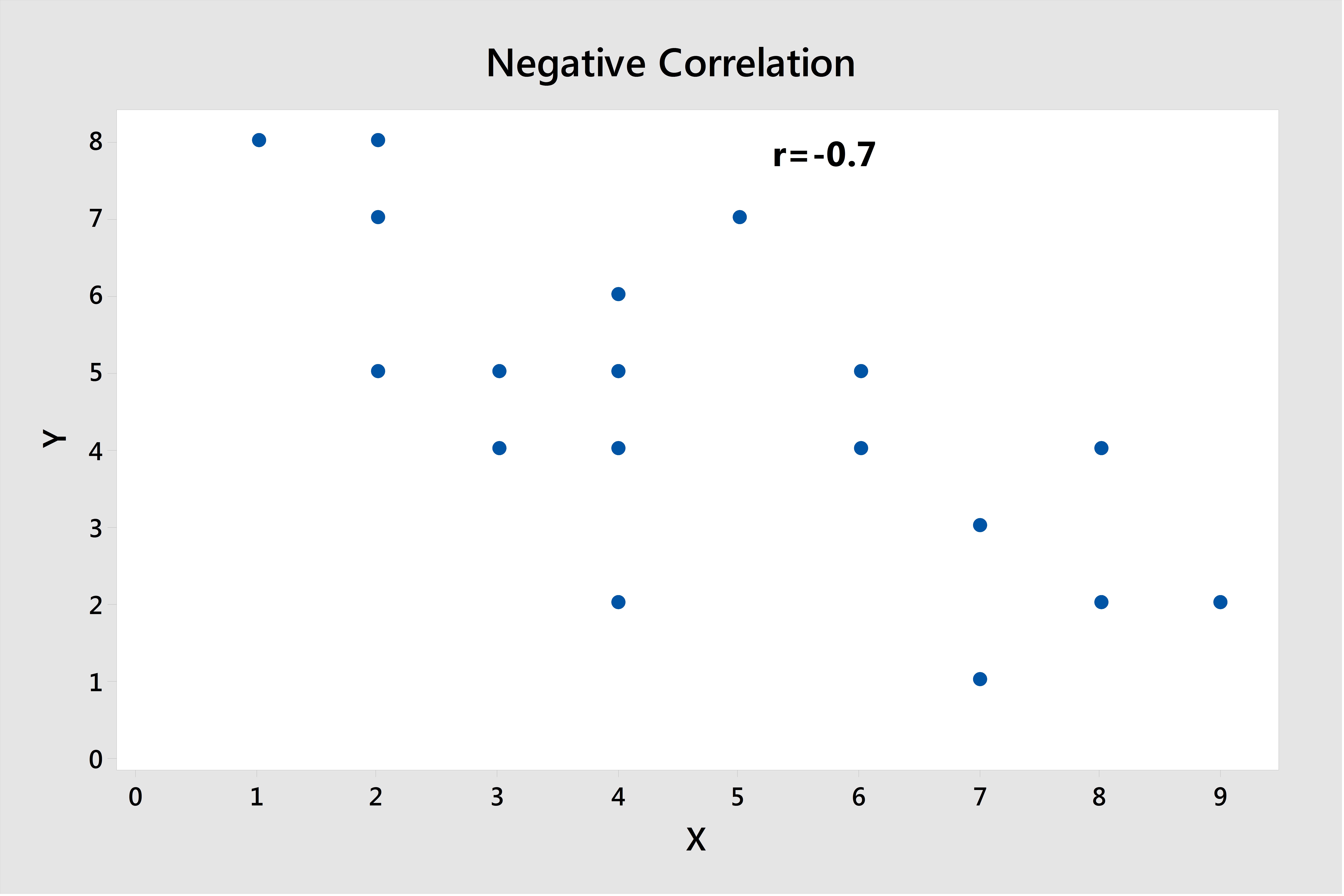
This graph shows a positive correlation of 0.7; close to 1. As you can see from the scatterplot, it's a fairly strong linear relationship. As the values of X tend to increase, Y tends to increase as well. Below is a similar plot, but here the relationship shows a negative direction.

Correlation's Limits
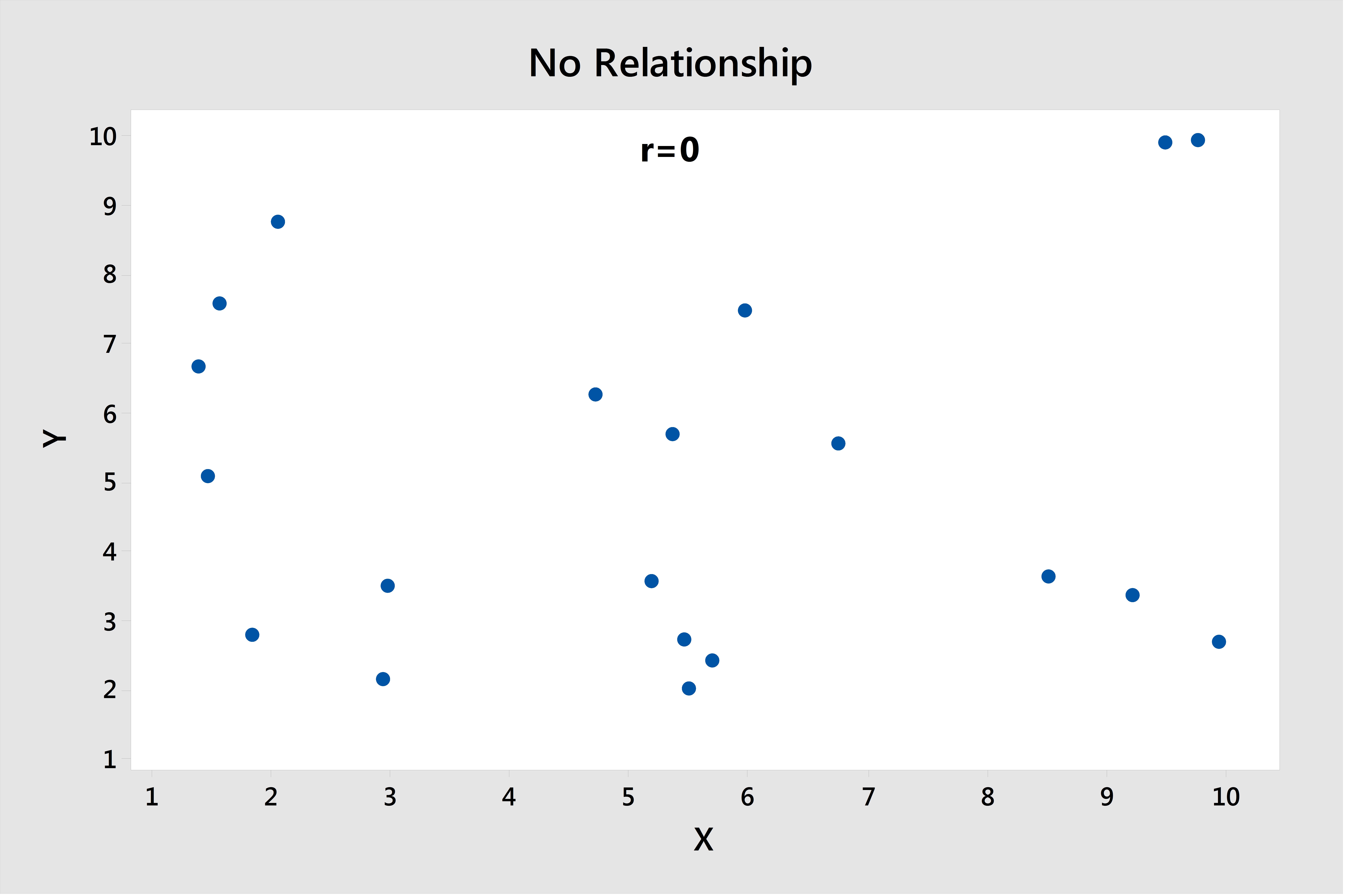
However, there are some drawbacks and limitations to simple linear correlation. A correlation coefficient can only tell whether your two variables have a linear relationship. Take, for example, the following chart, which has a correlation coefficient of about 0; we can pretty easily see that there isn't much of a relationship at all:

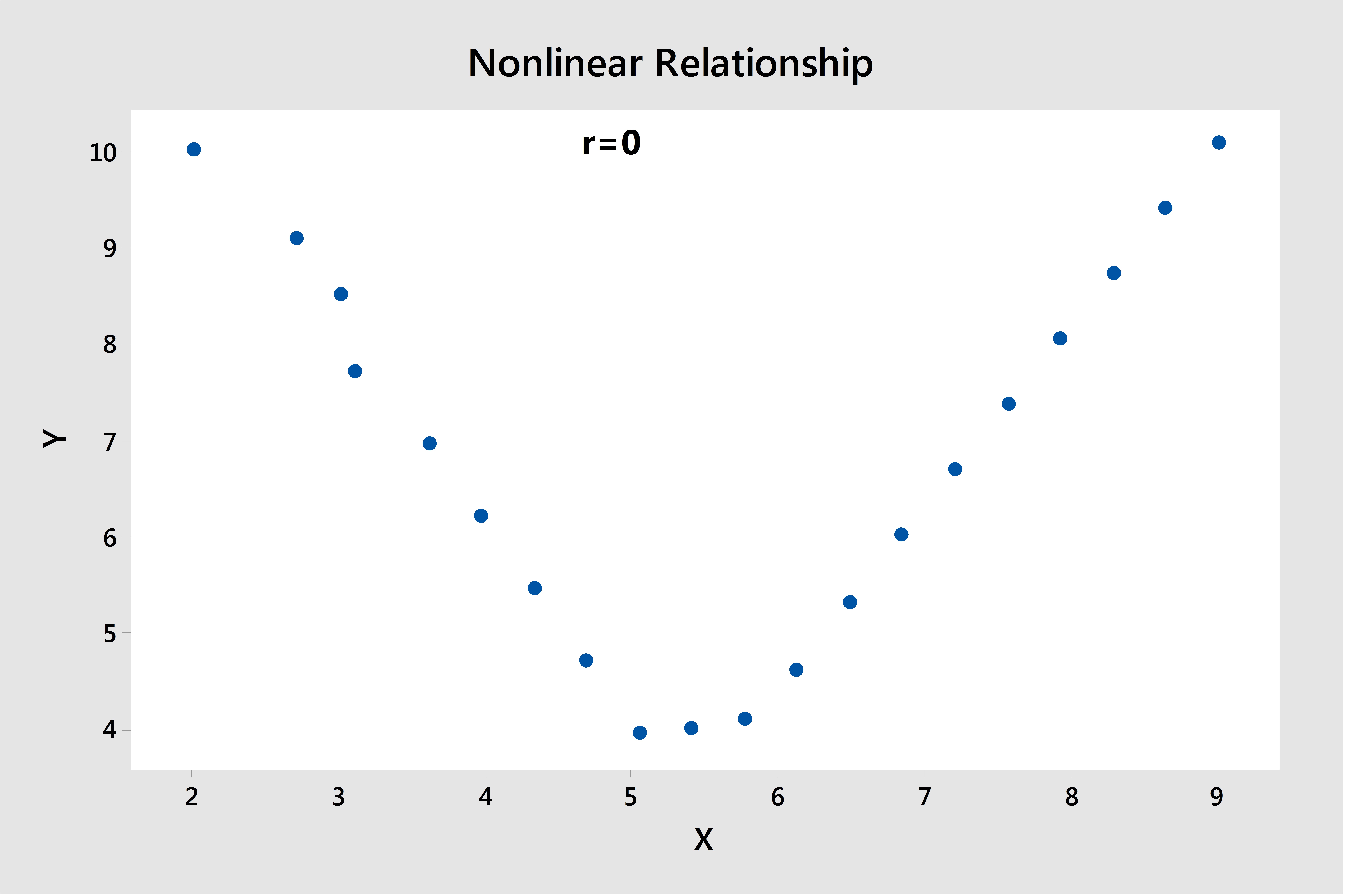
However, now take a look at this graph, in which there is an obvious relationship, but not a linear one. Notice that the correlation coefficient is also 0 in this case:

This is what you have to keep in mind when interpreting correlations. The correlation coefficient will only detect linear relationships. Just because the correlation coefficient is near 0, it doesn't mean that there isn't some type of relationship there.
The other thing to remember is something most of us hear soon after we begin exploring data—that correlation does not imply causation. Just because X and Y are correlated in some way does not mean that X causes a change in Y, or vice versa.
Here's my favorite example for this. If we look at two variables, shark attacks and ice cream sales, we know intuitively that there's no way one variable has a cause-and-effect impact on the other. However, both shark attacks and ice cream sales will have greater numbers in summer months, so they will be strongly correlated with each other. Be careful not to fall into this trap with your data!
Correlation has a lot of benefits, and it is still a good starting point in a number of different cases, but it's important to know its limitations as well.


