One of the biggest pieces of international news last year was the so-called "Brexit" referendum, in which a majority of voters in the United Kingdom cast their ballots to leave the European Union (EU).
That outcome shocked the world. Follow-up media coverage has asserted that the younger generation prefers to remain in the EU since that means more opportunities on the continent. The older generation, on the other hand, prefers to leave the EU.As a statistician, I wanted to look at the data to see what I could find out about the Brexit vote, and recently the BBC published an article that included some detailed data.
In this post, I'll use Minitab Statistical Software to explore the data from the BBC site along with the data from the Electoral Commission website. I hope this exploration will give you some ideas about how you might use publicly available data to get insights about your customers or other aspects of your business.
The electoral commission data contains the voting details of all 382 regions in the United Kingdom. It includes information on voter turnout, the percent who voted to leave the EU, and the percent who voted to remain. (If you'd like to follow along, open the BrexitData1 and BrexitData2 worksheets in Minitab 18. If you don't already have Minitab, you can download the 30-day trial.)
I began by creating scatterplots (in Minitab, go to Graph > Scatterplot...) of the percentage of voter turnout against the percentage of the population that voted to leave for each region, as shown below.
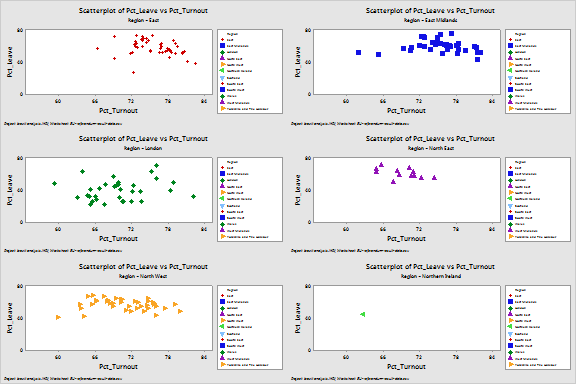
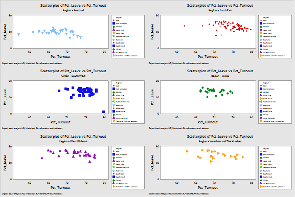
According to commentators, areas with high voter turnout had a tendency to vote to leave, as the elderly were more likely to turn up to vote. There is also a perceptible difference between the plots for the different areas.
To make this easier to analyze, I created an indicator variable called “decided to leave” in my Minitab worksheet. This variable takes the value of 1 if the area voted to leave the EU, and takes the value 0 otherwise. Tallying the number of areas in each region that voted to leave or remain (Stat > Tables > Tally Individual Variables...) yields the following:
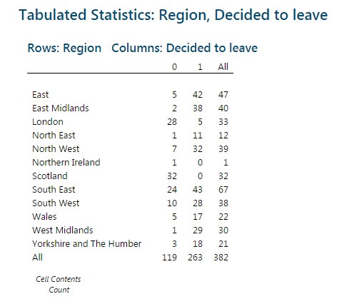
There are indeed regional differences. For example, London and Scotland voted strongly to remain while North East and North West voted strongly to leave. So, do we see greater voter turnout in the regions that voted to leave? Looking at the average turnout in each region (using Stat > Display Descriptive Statistics...), we have the following:
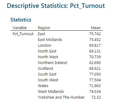
Surprisingly, the average turnout of regions that voted strongly to leave is not very different from the turnout of regions that voted strongly to remain. For example, the average turnout of 69.817% in London compared to 70.739% in North West.
The data set analyzed in the BBC article contains localised voting data supplied to the BBC by councils which counted the EU referendum. This data is more detailed than the regional data from the Electoral Commission, and it includes a detailed breakdown of how the people in individual electoral wards voted.
The BBC asked all the counting areas for these figures. Three councils did not reply. The remaining missing data could be due to any of the following reasons:
- The council refused to give the information to the BBC.
- No geographical information was available because all ballot boxes were mixed before counting.
- The council conducted a number of mini-counts that combined ballot boxes in a way that does not correspond to individual wards.
For those wards that have voting data, I also gathered the following information from the last census for each area.
- Percent of population in an area with level 4 qualification or higher. This includes individuals with a higher certificate/diploma, foundation degree, undergraduate degree, or master’s degree up to a doctorate. I will call this variable “degree” to represent individuals holding degrees or equivalent qualification.
- Percentage of young people (age 18-29) in an area.
- Percentage of middle-aged (age 30-59) in an area.
- Percentage of elderly (age 65 or above) in an area.
There is some difference in how some wards are defined between this data set and the data from the last census, perhaps due to changes in ward boundaries. Thus, for some wards, it was not possible to match the corresponding percentages of different age groups and degree holders. Therefore, some areas had to be omitted from my analysis, leaving me with data from a total of 1,069 wards.
With the exception of Scotland, Northern Ireland, and Wales, I have data from wards in all regions of the UK. The number of measurements from each region appears below.
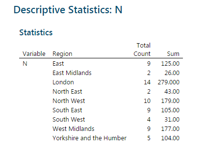
As with the Electoral Commission data, let’s begin by looking at some graphs. Below is a scatterplot of the percentage voting to leave against the percent of the population with a degree in an area.
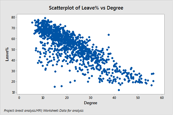
As you can see, the higher the percentage of people in an area who had a degree, the lower the percentage of the population that voted to leave. However, there are exceptions. For example, for Osterley and Spring Grove in Hounslow, the percentage that voted to leave is 63.41%, with a higher percentage of degree holders at 37.5566%. However, the area has a small proportion of young adults, at 19.3538%.
Let's look at the voting behaviour for different age groups. I created scatterplots of the percentage that voted to leave against different age groups.
The next plot shows percentage that voted to leave against the percentage of young people (age 18-29) in an area:
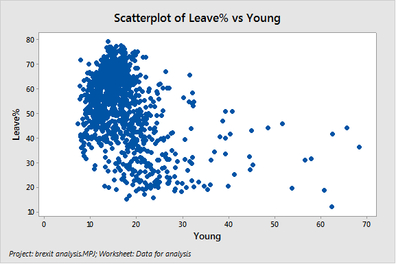
Areas with a higher percentage of young people appear to have a smaller percentage of people who voted to leave.
The following plot shows the percentage of the population that voted to leave against the percentage of elderly residents:
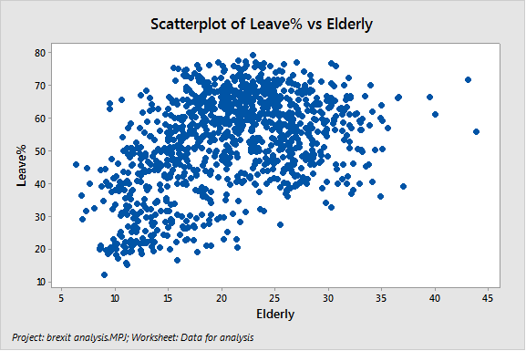
This plot shows the opposite situation shown in the previous one: areas with a higher proportion of elderly residents voted more strongly to leave.
These scatterplots support what’s being said in pieces such as the article on the BBC's website. However, in statistics, we like to verify that the relationship is significant. Let’s look at the correlation coefficients (Stat > Basic Statistics > Correlation...).
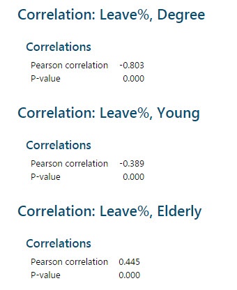
The correlation output in Minitab includes a p-value. If the p-value is less than the chosen significance level, it tells you the correlation coefficient is significantly different from 0—in other words, a correlation exists. Since we selected an alpha value (or significance level) of 0.05, we can say that all the coefficients calculated above are significant and that there are correlations between these factors.
Thus, the proportion of degree holders in an area has a strong negative impact on voting to leave. On the other hand, the proportion of elderly residents in an area has a strong positive impact on voting to leave.
Going a step further, I fit a regression model (Stat > Regression > Regression > Fit Regression Model...) that links the percent voting to leave with the proportion of degree holders and different age groups.
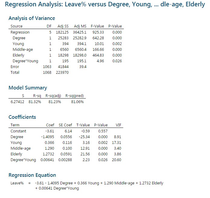
While there is no need to use the equation to make a prediction, we can still get some interesting information from the results.
The different age groups and proportion of degree holders all have an impact on the percentage voting to leave. The coefficient for the “degree” term is negative, and this implies for each unit increase in the percent of degree holders, the percentage voting to leave drops by 1.4095. On the other hand, for a unit increase in the percentage of elderly, the percentage voting to leave increases by 1.2732. In addition, there is a significant interaction between the percentage of degree holders and young people: Every unit increase in this interaction term only increases the percent voting to leave by 0.00641.
The results I obtained when I analyzed the data with Minitab support the commonly held view that younger voters preferred to remain in the EU, while older voters preferred to leave. The analysis also underscores the complicated politics surrounding Brexit, a reality that became apparent in the recent general election. One thing seems certain now that Brexit talks are imminent: balancing the needs and desires of the people from different age groups and backgrounds will be a tremendous task.


