


In 2011 we had solar panels fitted on our property. In the last few months we have noticed a few problems with the inverter (the equipment that converts the electricity generated by the panels from DC to AC, and manages the transfer of unused electric to the power company). It was shutting down at various times throughout the day, typically when it was very sunny, resulting in no electricity being generated.
I contacted the inverter manufacturer for some help to diagnose the problem. They asked me to download their monitoring app, called Sunny Portal. I did this and started a communication process with the inverter via Bluetooth, which not only showed me the error code but also delivered a time series of the electricity generated by the hour since the panels were installed.
I thought I had gone to statistician heaven! By using this data, I could establish if this problem was significantly reducing the amount of electricity generated and, consequently, reducing the amount of cash I was being paid for generating electricity.
The Sunny Portal, does have some basic bar charts to plot time series, by the month, day, and 5-minute interval; however, each chart automatically works out the scale according to the data so it is difficult to compare time periods.
Top Minitab Tip: If you want to compare multiple charts measuring the same thing for different time periods or groups, make sure the Y-axis scales are the same. In many Minitab graphs and charts, if you select the Multiple Graphs button you will be given the option to select the same Y-axis scale.
Getting the Data into Minitab
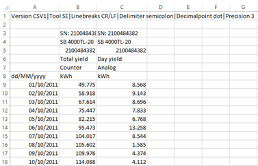
I realized that I could output the data to text files, which meant I could use my statistical skills and Minitab to answer my questions. For each month between Sept 2011 and June 2016 I exported a file like the example shown below. For each day I have the date, the cumulative units generated since the inverter was commissioned, and the daily generation.
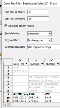
These were easily read into Minitab, using File > Open, specifying the first row of data as row 9, and changing the delimiter from comma to semicolon.
I read all of these monthly files into individual Minitab worksheets and then used Data > Stack Worksheets to create a single worksheet that contained all the data.
Creating and Reviewing the Time Series Plots
Using Graph > Time Series Plot, I created the following time series plots. To get each year in different colours, I double-clicked on an individual data point in the chart, chose the "Groups" tab in the Edit Symbols dialog box, and put Year as the grouping variable.
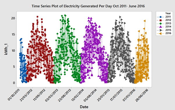
Looking at this plot, it was clear that the most electricity is generated in the summer months and least in the winter months, but it was not easy to identify if the amount of electricity generated had been declining. I needed to consider another analytical approach.
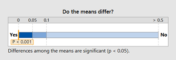
Since I have only noticed this problem in the last 6 months, (Jan to June 2016) I decided to compare the electricity generated in the first 6 months of the year for the years 2012–2016. I did this using Assistant > Hypothesis Tests > One Way Anova. The descriptive results were as follows:
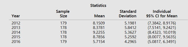
Just looking at the summary statistics, I can clearly see that the average electric units generated per day for the first six months of 2016 is much lower at 5.71 units than it was in the previous years, which range between 8.15 in 2012 and 9.22 in 2014. However by using the results from the one-way ANOVA I can work out if 2016 is significantly worse than previous years.
From this chart, you can see that the p-value is less than 0.001. Hence, we can conclude that not all the group means are equal. By using the Means Comparision Chart, shown below I can also see that 2016 is significantly lower than all the other years.
However, you might be thinking that first six months 2016 in England were darker than an average year, and there has been significantly less UV light. This might be a fair point, so to check this I looked at data produced by the UK Met Office, (www.metoffice.gov.uk/climate/uk/summaries/anomalygraphs). These charts, called anomaly graphs, compare the sunshine levels by month for particular years to the average sunshine levels for the previous decade.
The results for 2016 and 2012, the two worst years for average electricity generated per day, are as follows:
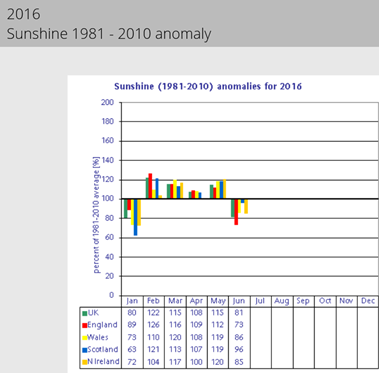
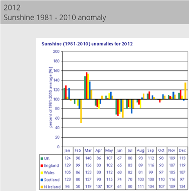
When I compare Met Office data for the amount of sunshine in the first six months of 2016 in England (red bar), with 2012, the second-worst year according to my the summary statistics, I can see that only Jan and March were better in 2012. It should also be noted you generate more electricity when there are more daylight hours. So a bad June has a bigger influence on electricity generated than a bad January, and June in 2012 was worse than 2016.
Consequently, I can see that the English weather cannot be blamed for the lower electricity generation figures and the fault is with my inverter. The next steps are to determine when this problem with the inverter started, and estimate what it has cost.
After I shared my results, the helpdesk at the manufacturer identified the problem with the Inverter: it had been set up with German power grid settings, and apparently the UK grid has more voltage fluctuation. The settings were changed on 15th July, and I'm looking forward to collecting more data and analyzing it in Minitab to determine whether this problem has been solved