


Histograms are one of the most common graphs used to display numeric data. Anyone who takes a statistics course is likely to learn about the histogram, and for good reason: histograms are easy to understand and can instantly tell you a lot about your data.
Here are three of the most important things you can learn by looking at a histogram.
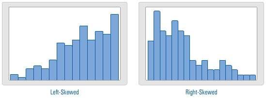
Shape—Mirror, Mirror, On the Wall…
If the left side of a histogram resembles a mirror image of the right side, then the data are said to be symmetric. In this case, the mean (or average) is a good approximation for the center of the data. And we can therefore safely utilize statistical tools that use the mean to analyze our data, such as t-tests.
If the data are not symmetric, then the data are either left-skewed or right-skewed. If the data are skewed, then the mean may not provide a good estimate for the center of the data and represent where most of the data fall. In this case, you should consider using the median to evaluate the center of the data, rather than the mean.
Did you know...
If the data are left-skewed, then the mean is typically LESS THAN the median.
If the data are right-skewed, then the mean is typically GREATER THAN the median.
Span—A Little or a Lot?
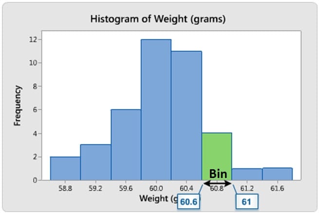 Suppose you have a data set that contains the salaries of people who work at your organization. It would be interesting to know where the minimum and maximum values fall, and where you are relative to those values. Because histograms use bins to display data—where a bin represents a given range of values—you can’t see exactly what the specific values are for the minimum and maximum, like you can on an individual value plot. However, you can still observe an approximation for the range and see how spread out the data are. And you can answer questions such as "Is there a little bit of variability in my organization's salaries, or a lot?"
Outliers (and the ozone layer)
Outliers can be described as extremely low or high values that do not fall near any other data points. Sometimes outliers represent unusual cases. Other times they represent data entry errors, or perhaps data that does not belong with the other data of interest. Whatever the case may be, outliers can easily be identified using a histogram and should be investigated as they can shed interesting information about your data.
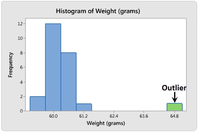
Rewind to the mid-1980s when scientists reported depleting ozone levels above Antarctica. The Goddard Space Center had studied atmospheric ozone levels, but surprisingly didn’t discover the issue. Why? The analysis they used automatically eliminated any Dobson readings below 180 units because ozone levels that low were thought to be impossible.