


Control charts are a fantastic tool. These charts plot your process data to identify common cause and special cause variation. By identifying the different causes of variation, you can take action on your process without over-controlling it.
Assessing the stability of a process can help you determine whether there is a problem and identify the source of the problem. Is the mean too high, too low, or unstable? Is variability a problem? If so, is the variability inherent in the process or attributable to specific sources? Control charts answer these questions, which can guide your corrective efforts.
Determining that your process is stable is good information all by itself, but it is also a prerequisite for further analysis, such as capability analysis. Before assessing process capability, you must be sure that your process is stable. An unstable process is unpredictable. If your process is stable, you can predict future performance and improve its capability.
While we associate control charts with business processes, I’ll argue in this post that control charts provide the same great benefits in other areas beyond statistical process control (SPC) and Six Sigma. In fact, you’ll see several examples where control charts find answers that you’d be hard pressed to uncover using different methods.
The Importance of Assessing Whether Other Types of Processes Are In Control
I want you to expand your mental concept of a process to include processes outside the business environment. After all, unstable process levels and excessive variability can be problems in many different settings. For example:
- A teacher has a process that helps students learn the material as measured by test scores.
- A diabetic has a process for keeping blood sugar in control.
- A researcher has a process that causes subjects to experience an impact of 6 times their body weight.
All of these processes can be stable or unstable, have a certain amount of inherent variability, and can also have special causes of variability. Understanding these issues can help improve all of them.
The third bullet relates to a research study that I was involved with. Our research goal was to have middle school subjects jump from 24-inch steps, 30 times, every other school day to determine whether it would increase their bone density. We defined our treatment as the subjects experiencing an impact of 6 body weights. However, we weren’t quite hitting the mark.
To guide our corrective efforts, I conducted a pilot study and graphed the results in the Xbar-S chart below.
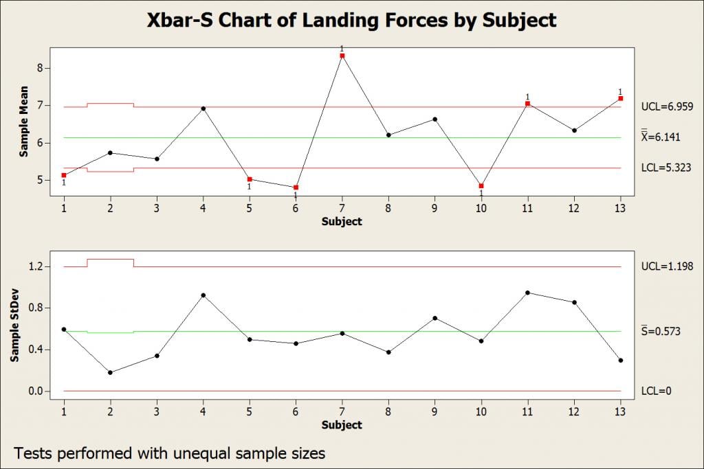
The in-control S chart (bottom) shows that each subject has a consistent landing style that produces impacts of a consistent magnitude—the variability is in control. However, the out-of-control Xbar chart (top) indicates that, while the overall mean (6.141) exceeds our target, different subjects have very different means. Collectively, the chart shows that some subjects are consistently hard landers while others are consistently soft landers. The control chart suggests that the variability is not inherent in the process (common cause variation) but rather assignable to differences between subjects (special cause variation).
Based on this information, we decided to train the subjects how to land and to have a nurse observe all of the jumping sessions. This ongoing training and corrective action reduced the variability enough so that the impacts were consistently greater than 6 body weights.
Control Charts as a Prerequisite for Statistical Hypothesis Tests
As I mentioned, control charts are also important because they can verify the assumption that a process is stable, which is required to produce a valid capability analysis. We don’t often think of using control charts to test the assumptions for hypothesis tests in a similar fashion, but they are very useful for that as well.
The assumption that the measurements used in a hypothesis test are stable is often overlooked. As with any process, if the measurements are not stable, you can’t make inferences about whatever you are measuring.
Let’s assume that we’re comparing test scores between group A and group B. We’ll use this data set to perform a 2-sample t-test as shown below.
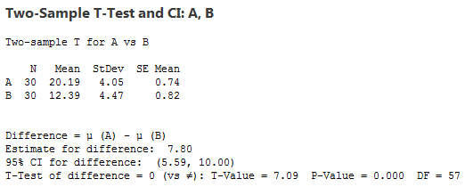
The results appear to show that group A has the higher mean and that the difference is statistically significant. Group B has a marginally higher standard deviation, but we’re not assuming equal variances, so that’s not a problem. If you conduct normality tests, you’ll see that the data for both groups are normally distributed—although we have a sufficient number of observations per group that we don’t have to worry about normality. All is good, right?
The I-MR charts below suggest otherwise!
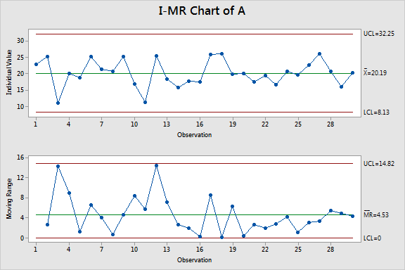
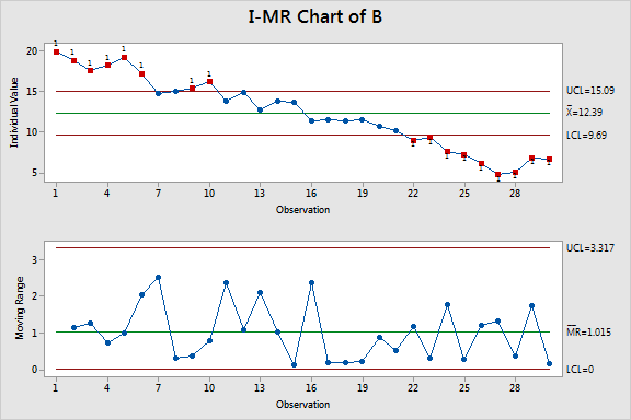
The chart for group A shows that these scores are stable. However, in group B, the multiple out-of-control points indicate that the scores are unstable. Clearly, there is a negative trend. Comparing a stable group to an unstable group is not a valid comparison even though the data satisfy the other assumptions.
This I-MR chart illustrates just one type of problem that control charts can detect. Control charts can also test for a variety of patterns in the data and for out-of-control variability. As these data show, you can miss problems using other methods.
Using the Different Types of Control Charts
The I-MR chart assesses the stability of the mean and standard deviation when you don’t have subgroups, while the XBar-S chart shown earlier assesses the same parameters but with subgroups.
You can also use other control charts to test other types of data. In Minitab, the U Chart and Laney U’ Chart are control charts that use the Poisson distribution. You can use these charts in conjunction with the 1-Sample and 2-Sample Poisson Rate tests. The P Chart and Laney P’ Chart are control charts that use the binomial distribution. Use these charts with the 1 Proportion and 2 Proportions tests.
If you're using Minitab Statistical Software, you can choose Assistant > Control Charts and get step-by-step guidance through the process of creating a control chart, from determining what type of data you have, to making sure that your data meets necessary assumptions, to interpreting the results of your chart.
Additionally, check out the great control charts tutorial put together by my colleague, Eston Martz.