


Science television shows are the main reason that we have cable TV in my house! We recently saw a show in which researchers recorded dolphin squeaks to determine whether their sounds are a real language. The researchers claimed that word usage in all human languages follows a specific distribution, and they were going to determine whether dolphin sounds follow the same distribution.
It turns out that they do.
This led the scientists to conclude that the dolphin's language has the capacity to efficiently convey information, just like human language. Upon further research, I found that some SETI scientists are looking into using the same technique to determine whether signals from space contain noise or information.
This was my first taste of the well-established field of information theory. The cool thing about this approach is that you don’t have to actually understand the message. Instead, you statistically assess the structure to determine if it’s optimized for transferring information.
Science is best when it’s a hands-on experience. And Minitab Statistical Software can be like your backstage pass to science! If you can collect good data, you can use Minitab to investigate pretty much anything. So, while I can’t collect data on alien transmissions or dolphin squeaks, I can collect data on word usage. Ultimately, I will assess whether my own words follow the expected distribution, because that distribution appears to be the linchpin for the rest of the research.
Let's look at the fundamentals behind information theory using my data. In my next post, we'll see how well my words fit the theoretical distribution.
Methodology
The sources of my data are the 39 blog posts that I’ve written for Minitab before this one. The data analysis uses the frequency of occurrence and rank of each word that appears in the text. So the first step is to take my blog posts and break them down by unique words and the number of their occurrences. To do this, I put the text of each blog post into this website. Then I collated and saved the output from the website into a text file, which I imported into Minitab. Using Minitab, I combined the words and frequencies from the individual blog posts into one combined list.
You can get my data file here. There are two worksheets in the project. One worksheet lists the number of unique words and total words for each blog post. The other worksheet contains the words, frequencies, and the ranks.
Summary of Word Usage
The 39 blog posts contain a total of 35,801 total words, or nearly 920 words per post. Each blog post has an average of 350 unique words. There are a total of 3,720 unique words in all 39 posts. (You can’t simply sum the number of unique words for all posts because the different posts share words.)
Just from the summary statistics, you can see that I use relatively few words over and over to express a wide variety of ideas. After all, the percentage of unique words (3,720) to total words (35,801) is only 10.3%! This pattern is typical, and the high rate of reuse gets to the heart of information theory and the distribution that we’ll ultimately test.
Common Words in the Raw Data
Before we get into the statistical analysis, let’s take a look at the raw data. Below are the 20 most common words that I used in my blog posts.
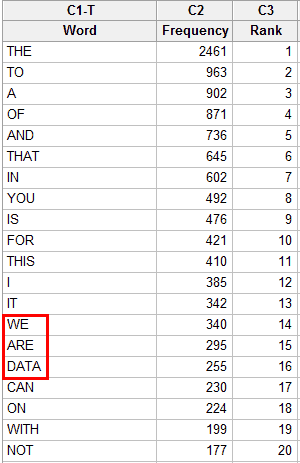
For the most part, it is a fairly standard list of common words. However, if you look at #16 you see the first indication that the words are drawn from a specialized sample. In everyday English, “data” is no where near the 16th most commonly used word. Oh, what a great world it would be if the average person used “data” as frequently as “are” and “can”!
I can’t help but chuckle seeing the sequence of the 14th, 15th, and 16th words, because they accurately describe us here at Minitab: WE ARE DATA!
“Data” is not in a list of the top 500 most commonly used English words. Other examples of unusual words that appear in my top 50 list include: estimates, model, regression, results, variables, analysis and Minitab. These are not in the top 500 words of everyday English but, again, reflect the specialized nature of the blog topics.
Also, notice how the higher-ranked words tend to be shorter than the lower-ranked words. This pattern is a natural form of compression that helps prevent sentences from becoming too long. According to information theorists, this non-random pattern increases the efficiency for conveying information.
Graphing the Structure of the Data
You can also get a good sense about the distribution of the data by observing how quickly the frequency drops with rank. There are 2,461 instances of “the,” but fewer than half of that for “to,” which is the next most common word. By the time we get down to #20, we see that there are only 177 instances of “not.”
We can graph the occurrence of all words using a Pareto chart.
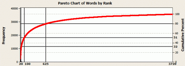
On this Pareto chart, the x-axis is the rank for each unique word in the sample, from 1 to 3,720. Notice how quickly the points rise at the beginning and then level off. This graph shows the classic Pareto behavior where about 80% of outcomes come from 20% of the causes (the 80-20 rule). For these data, the 625 most common words (16.8%) account for 80% of the word usage. “The” is the top ranked word and accounts for 6.8% of all words by itself. The top 20 words account for nearly a third of the text. The top 100 words account for just over half.
The percentages above are not just true for my blog text, but true of English in general. A corpus of the English language is a large representative sample of English as it’s actually used in a wide a variety of settings. These settings include: novels, specialized journals, newspapers, emails, chat rooms, and, yes, blogs! Studies of the English corpus yield the same properties as the words in my blogs. Specifically, relatively few words account for a large percentage of the total words. The percentages for the English corpus match those discussed above for my blog corpus.
This distribution of frequency by rank is another non-random pattern that information theorists look for, and this distribution will play a key role in my next post.
Proportion of Unique Words
We can also look at the relationship between the length of the text and the proportion of unique words to total words. Does the length of the text affect the number of times that you reuse words? Is it a constant rate, or does it change? We can answer that question with a fitted line plot based on my blog data.
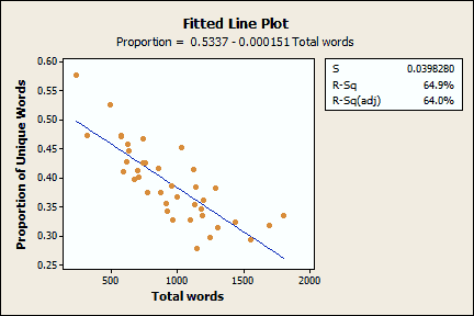
Each point on this graph represents one blog post. The fitted line plot shows that as the number of total words in a blog post increases, the proportion of unique words decreases. In other words, as I add more words, I tend to reuse words more than adding new words. The proportion starts at around 0.50 for a couple hundred words and ends up at around 0.25 for a couple of thousand. Further, at 35,801 words, the combined length of all blog posts, the ratio is down to 0.10. This suggests that the slope of the fitted line starts to flatten out at some point. One caveat: 35,801 words is the sum of all data points rather than an independent data point. Therefore, we should interpret it with caution. However, I suspect that the proportion at that combined point is in the right ballpark.
The Signature of Information
Information theorists look for a number of non-random patterns in their data to statistically assess the capacity of a signal to convey information. We saw how the specific words in my word ranking differed from the ranking based on a representative corpus of English texts. Yet, the underlying structure of the blog data appears to be consistent with the English corpus.
Information theory goes further and suggests that this pattern is present in any communication that is optimized for conveying information. In other words, information bears a distinct signature that you can detect regardless of whether the message consists of any human language, computer network traffic, dolphin squeaks, or alien symbols.
In my next post, I will use more sophisticated analyses in Minitab to more precisely determine whether my blog posts have the signature of noise or information. There are some surprising conclusions!