


A statistician walks into a party. The host looks up and says “Welcome! Let me introduce you to everyone. This is John, Jeff, Jill, another Jeff, Petra, Porter, Paxtyn and Chris.” The statistician declares, “I love parties that exhibit properties of the Pareto principle!”
The host—not a statistician—slowly turns and walks away, befuddled and bewildered.
True story? Almost, except I kept inner monologue about the Pareto principle to myself!
A Little Pareto Chart History
Back in the early 1900s, engineer, economist and sociologist, Vilfredo Pareto made a similar observation. However, it wasn’t about how nearly every partygoer's name started with one of two letters. Rather, it was regarding the unequal distribution of Italy’s wealth, where, Pareto noted, about 80% belonged to 20% of the population.
And so began the origins of the 80-20 rule, later called the “Pareto principle” by Joseph Juran. (While some may argue that Juran’s application of Pareto’s observation is inaccurate, one cannot deny its utility, which is our goal here.)
The Pareto principle states that about 80% of outcomes come from 20% of the causes. And whether you’re assessing a population’s wealth, a company's profits, a product's defects, a store's customer complaints, or some other outcome, the Pareto chart is a must-have in any analyst’s toolbox.
The Pareto chart plots the frequencies and corresponding percentages of a categorical variable. It helps you identify the vital few—the “20%" that really matters. It helps you prioritize and shows you where to focus your efforts and resources.
Pareto-Charting Fast Food: Do You Want Fries with That?
Let’s look at fast food chains as an example. There are a whole lot of them. In Minitab Statistical Software, I made a list of 25 popular chains and the approximate number of locations for each, and then used Stat > Quality Tools > Pareto Chart to graph the data:
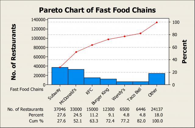
Along the x-axis, Minitab displays the name of each restaurant, followed by the number of locations, the percent of the total and the cumulative percentage. Above, we can see that Subway has the most locations, with 37,046, which comprise 27.6% of all the fast food restaurants I researched. And if we combine Subway and McDonald’s, these two chains represent a whopping cumulative percentage of 52.1%! That means that more than half of all fast food locations are either a Subway or McDonald’s, and judging by the distribution of fast food establishments in my town alone, I’m not surprised.
In Minitab, you can specify the cut-off for the cumulative percentage. I used 80% in this case, so once the cumulative percentage reached 80%, Minitab lumped all other fast food chains into "Other.” Of the 25 different chains included in this analysis, 5 account for nearly 80% of all locations: Subway, McDonald’s, KFC, Burger King, and Wendy’s. The percentage breakdown is therefore more like 80-25 than 80-20, but the principle that a small aggregate represents the majority still applies.
Other Applications for the Pareto Chart
Looking at a Pareto chart of fast food chains certainly isn’t going to solve world peace, but you can see how these charts allow you to quickly identify the vital few for any categorical dataset. And the applications are endless:
- Manufacturing – What defect types are most prevalent and key to improving an inspection process?
- Marketing – Where are the majority of my advertising dollars going? Which channels produce the most sales leads?
- Healthcare – What types of infections are the most prevalent? What procedures are associated with the majority of return hospital visits?
- Sales – Does a small percentage of customers account for a large percentage of revenue? If so, which ones?
- Customer Service – How can I improve customer satisfaction? What do customers complain about the most?
And maybe 20% of your e-mails take up 80% of your time. Or, thinking about Minitab, would you say you use 20% of its features 80% of the time? Or, perhaps you wear 20% of your clothes and shoes 80% of the time, and it’s time to use Minitab to help you clean out your closet!
Whatever the application, thanks to the observations of Pareto we can use this special chart to identify and separate the vital few from the trivial many. So anytime you have attribute data and you want to quickly identify what those vital few are, give the Pareto chart a try.