Time series plots help us see variations over time by displaying observations on the y-axis against equally spaced time intervals on the x-axis. In Lean Six Sigma, they can show you the before-and-after effects of a process change.
I recently used a time series plot to see how the price of gold has changed over time. After reaching record highs recently, gold prices have dipped, although some analysts are predicting they’re ready to rebound.
These ups and downs made me curious about patterns in gold prices over a longer period. How would that data look on a time series plot? Would it reveal any interesting patterns or trends?
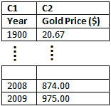
I found the annual price of gold per ounce over the last 110 years and copied it into a Minitab worksheet. One column was the year. The next column was the price of gold per ounce (in dollars).

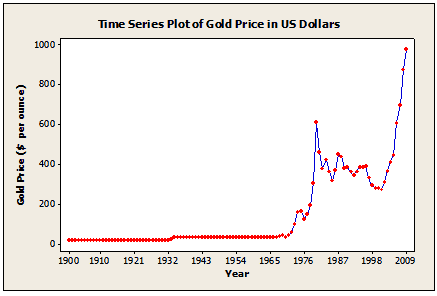
Then I displayed the data in a time series plot. (To do this yourself with Minitab Statistical Software, choose Graph > Time Series Plot > Simple. In Series, enter Gold Price ($). Click Time/Scale, select Stamp, and enter Year.) I got this plot:

Notice any patterns? From 1900 to about 1932, the price was extremely steady. Hmm, that’s odd. There’s a little bump in price in the early 1930s, but then it flatlines again until shortly after 1968.
What’s going on? Were people in the early 20th century incredibly level-headed about buying precious-metal commodities? And what’s with that sudden onset of erratic spikes and dips in the late 60s?
Digging deeper, I found the real explanation for these patterns was simpler and much more reasonable.
Turns out there was no free market for gold in the U.S. until 1968. Before then, gold prices were determined by the government, not the market. From 1900 until about 1933, the price of gold was fixed at the official price of $20.67. In about 1935, the official price was re-set to $35 per ounce.
So much for the theory of our level-headed ancestors vs. Jimi Hendrix.
Let's take a closer look at the free-market patterns. I could just copy and paste the data from 1968 onwards into new columns in the worksheet and then create a new time series plot using those columns. But I’m a little lazy when it comes to data manipulation, so I’ll use a neat little trick in Minitab instead.
· Press CTRL + E to bring up the same dialog I just used to create the original time series plot.
· Click Data Options. Under Specify which Rows to Include, select Rows, and enter 69:110 (row 69 is the year 1968, the first row I want to include; row 110 is the last row with data in my worksheet).
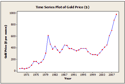
That gives me the time series plot with just the free-market gold prices:
What trends do you see now? Looks like the gold price was fairly steady from the 1980s until shortly after 2000—almost 20 years. But you can also see two big spikes in price, one from about 1976 to 1980, and the more recent spike from about 2003 up to the present.
Now, unfortunately, I’m not a financial analyst, so I can’t tell you how to use this chart to make millions of dollars buying and selling gold in the next few years. But if you use a time series plot to examine data from processes or fields that you know a lot about, then you’ll find a lot of meaningful ways to interpret the trend and patterns.
In fact, financial analysts use times series plots all the time—for example, to examine trends in gold and silver prices over many different time spans, from the last 24 hours to the last 100 years.
Another important use of time series plots is to detect time-order patterns that could indicate a source of bias in your data.
Now, if you'll excuse me, I need to call my broker.


