


Remember the classic science fiction film The Matrix? The dark sunglasses, the leather, computer monitors constantly raining streams of integers (inexplicably in base 10 rather than binary or hexadecimal)? And that mind-blowing plot twist when Neo takes the red pill from Morpheus' outstretched hand? Well to me, there's one thing even more mind-blowing than the plot of the Matrix: the Matrix Plot. You know, in Minitab Statistical Software. (Click here to download a free trial.)
Just as Neo and his band of futuristic rebels were constantly barraged with endless streams of data, it seems like we, too, often face large amounts of data and we must make sense of. When faced with such a challenge, a good place to start is to create some exploratory graphs in Minitab. Previous posts have extolled the virtues of the Individual Value Plot and Graphical Summary for this purpose. Today, we're going to use the oracle of all plots, the Matrix Plot, to uncover the secrets of automobile specifications data. (Follow the link and scroll to the bottom of the page to download the worksheet.)
The data set looks like this:
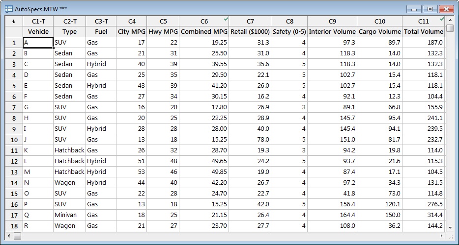
There's a lot to take in here. The columns look like streams of random numbers...but are they? Time to enter the matrix. A matrix plot is a great exploratory tool because you can throw a bunch of data in it and just see what happens.
From Minitab's Graph menu, choose Matrix Plot. Under Matrix of plots, choose With Groups, and fill out the dialog box thusly:
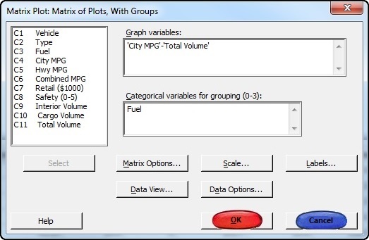
It is at this point that you must make a difficult choice. You can choose the blue pill1 (a.k.a., the Cancel button) and go about your business, oblivious to and untroubled by the mind-blowing automotive realities that surround you. Or you can choose the red pill (click OK), after which your life will forever be altered by your ability to see into the data, to understand it, and—with practice—to even control it.2
If you chose the blue pill, click here.
If you chose the red pill, read on.
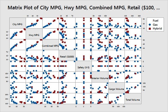
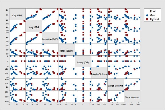
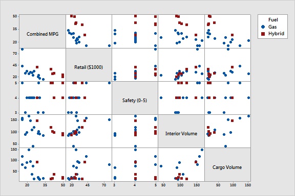
As you can see, the matrix plot packs a lot of information into a small space. I like to do a couple of things to allow the data to spread out just a little. Remove the graph title by clicking it and pressing Delete. Then, choose Editor > Graph Options, and select Don't alternate (under Alternate Ticks on Plots). There, that's a little better:
It's a lot to take in, but don't worry. Just as our band of heroes in The Matrix learned to read the endless streams of integers on their monitors, so too will this mass of dots soon make sense to you.
The matrix plot is simply a grid of scatterplots. For example, the left-most scatterplot in the top row shows City MPG on y-axis and Hwy MPG on the x-axis. Not surprisingly, there appears to be a very tight relationship between these two variables: vehicles with good city mileage tend to also have good highway mileage. You can tell from the scales that city MPG for all vehicles ranges between about 10 and 55 and that highway MPG ranges between about 19 and 50. From the symbols, you can also easily tell that the hybrid vehicles (red squares) get better mileage than gas-only vehicles (blue dots).
To simplify things, we can remove City MPG and Hwy MPG from the plot and leave just Total MGP (which is just City MPG + Hwy MPG). We can also remove Total Volume (which is Interior Volume + Cargo Volume).
To return to the Matrix Plot dialog box, you can press Ctrl + E. This time, in Graph variables, enter just columns C6 through C10.
(To maximize the space for data, I deleted the title and un-alternated the tick marks for this graph like we did for the last one.)
One thing that jumps out is that Safety isn't like the other variables. The other variables are continuous, but the safety ratings take on one of three discrete values: 3, 4, or 5. For discrete variables, the plot looks like an individual value plot. Interestingly, all hybrid vehicles scored a 4 or a 5; the only vehicles to score a 3 were gas-only.
Another thing that jumps out is the outlier in the Retail (price) measurements. While the other vehicles cost under $45,000, one vehicle sells for more than $70,000. Conveniently, we can brush the outlier and quickly see how that vehicle scores on the other measures. (For more information on this powerful tool, see Using brushing to investigate data points.)
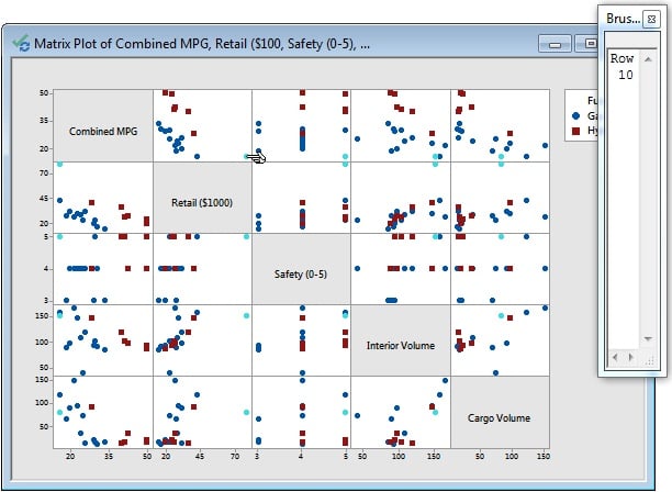
The brushing palette shows that the outlier is in row 10 of the worksheet. The point for this observation is highlighted in each plot of the matrix. So you can quickly tell, for example, that even though you may have to ransack your kid's college fund to afford this beauty, at least he or she will enjoy the extra passenger room afforded by this luxury vehicle. And they are assured to arrive at their non-college-campus destinations in one piece because this vehicle gets the highest safety rating. However, you may have to pass the hat for gas because it looks like this baby is always thirsty.
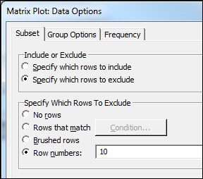
Among its other virtues, the high price tag has the added effect of squishing the data for the other vehicles into the low end of the scale and thus making the graph harder to read. Now that I've scratched this rig off my wish list, let's go ahead and remove it from the plot. Again, we use the Ctrl + E trick to reopen the dialog box. This time we click the Data Options button and specify to exclude row 10 from the graph:
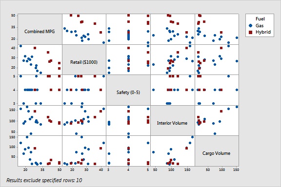
Without the gas-guzzling outlier in the picture, it becomes clear that there is another outlier in town. One of the vehicles has an unusually low interior volume. Again, we can brush this point to see what's going on.

Brushing shows that this vehicle is about average on the other measures. It doesn't cost less than the others and doesn't seem to get better mileage; it's just cramped on the inside. Not a big selling point. Let's remove this point as well. (This vehicle is in row 15.)
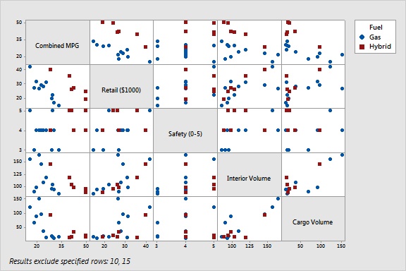
Without the outliers, the overall picture becomes still clearer. In general, it looks like more money does not buy you better gas mileage. The negative relationship between price and mileage is clear for both hybrid and gas-only vehicles. However, more money does seem to buy you more space. It looks like there is a positive relationship between price and interior volume and between price and cargo volume. Bigger vehicles are heavier and generate more wind resistance, so no wonder the more expensive vehicles tend to get worse gas mileage.

I think you'll agree that we have learned a lot about these data since we first entered the matrix just a few mouse clicks ago. No doubt more time in the matrix will reveal even more insights. Aren't you glad you chose the red pill?
Notes
1. The Matrix Plot dialog box featured in this post has been embellished for the purpose of dramatizing this reenactment. In real life, Minitab dialog boxes do not feature pills, or pharmaceutical agents of any kind. No actual dialog boxes or buttons were harmed during the making of this blog post. [return]
2. OK, so you can't really use a matrix plot to actually change the data in the worksheet. But you *can* use the matrix plot to change how *you see* the data and enable you to reveal more of your data secrets. And isn't that what's important? [return]
Acknowledgements
Credit for the original pill images goes to W.carter. Pills and steak dinner available under Creative Commons License 2.0 and Creative Commons License 1.0 respectively.