


In my time at Minitab, I’ve gotten a good understanding of what types of graphs users create. Everyone knows about histograms, bar charts, and time series plots. Even relatively less familiar plots like the interval plot and individual value plot are still used quite often. However, one of the most underutilized graphs we have available is the area graph. If you’re not familiar with an Area Graph, here’s the example from the Minitab help menu of what it looks like:
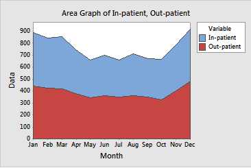
As you can see, an area graph is a great way to be able to view multiple time series trends in one plot, especially if those plots form a part of one whole. There are numerous ways this can be used to visualize things. Anytime you are interested in multiple series that make up a whole, an area graph can do the job. You could use it to show enrollment rates by gender, precipitation rates by county, population totals by city, etc.
I’m going to show you how to go about creating one in Minitab. First, we need to put our data in our worksheet. For this graph, we need each of the series, or sections, in a separate column. An additional constraint on this graph is that we need all of the columns to be of equal length, so be sure that’s the case. In our example we will use sales data from different regional branches, and show that an area graph can be an improvement over a simple time series plot.
Once it’s in your worksheet, we can go to Graph > Time Series Plot, and look at the data in a basic time series plot. As you can see, there are a few challenges with interpreting this plot.
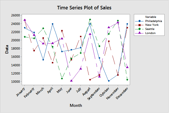
First, the plot looks extremely messy. While it gives a good look at the sales from the individual branches, it is very hard to track an individual branch through time. And it’s not much better to look at 4 (or more) separate individual plots, because it then makes it harder to compare. Additionally, when you make separate plots, an important piece of information is lost: total sales. For example, in August, Philadelphia, London, and Seattle had a total sales increase, while New York had its worst month of the year. Was this an overall gain or overall loss? We can’t really tell from individual plots.
Instead, let’s look at an Area Graph. You can find this by going to Graph > Area Graph, and entering the series the same way as we did the time series plot. Take a look at our output below:
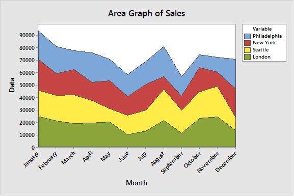
For starters, it looks much cleaner. We are able to see clear trends in the overall pattern. We can see that overall sales spiked in August, answering our question from above. We can use this to evaluate trends in multiple series, as well as the contribution of each series to the total quantity. We get all the information about total sales month-to-month, as well as the individual series for each location, in one plot, instead of in the messy, hard-to-read Time Series plot we created first.
Next time you need to evaluate multiple series together, considering taking a look at the Area Graph to get a cleaner picture of your data!