


In my last post, I imagined using the example of a rock and roll band -- the Zero Sigmas -- to explain Pareto charts to my music-loving but statistically-challenged boss. I showed him how easy it was to use a Pareto chart to visualize defects or problems that occur most often, using the example of various incidents that occurred on the Zero Sigmas last tour.
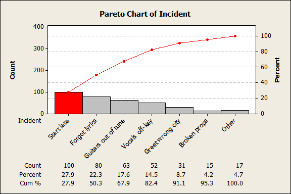
The Pareto chart revealed that starting performances late was far and away the Zero Sigmas' most frequent "defect," one that occurred every single night of the band's 100-day tour.
This is the point at which my boss would say, "I get it! We just need to make sure the Zero Sigmas hit the stage on time, and everything will be swell!"
"Not so fast there, sir," I would have to reply. "There's a question that this Pareto chart of frequency doesn't answer."
Are the Most Frequent Defects the Most Important?
We know the Zero Sigmas started every show late, making that the defect that occurred most often, and this information is valuable. It's also useful to see how frequently singer Hy P. Value forgot the words to his songs and greeted the wrong city when he hit the stage. ("Hello, Albuquerque!" was correct on only one night of the tour.)
All of these are incidents we'd like to happen much less frequently. But are they equal? Looking at just the raw counts of the incidents assumes all problems or defects are the same in terms of their consequences.
You can see why this is problematic if you think about defects that might occur in manufacturing a car: a scuff mark on the carpet is undesirable, but it's not on par with a disconnected brake cable. Similarly, if a shirt is sewn with thread that's just slightly off color, the defect is so small the garment might still be usable; a shirt with mismatched fasteners will need to reworked or discarded.
In the world of rock and roll, the Zero Sigmas starting a performance late probably has fewer consequences than their getting caught lip-syncing during a performance does. How is that reflected in the Pareto chart above? It's not.
When different defects have different impacts, a Pareto chart based only on number of occurrences doesn't provide enough information to tell you which issues are the most important.
Are You Counting the Right Thing?
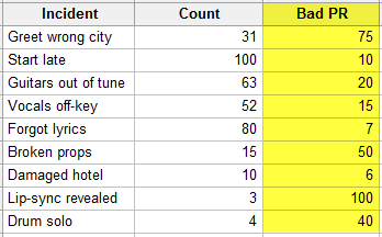
You might be able to learn more by looking at a different measurement. In many situations, you do want to know the number of defects. But that's not always what you want to measure. For example, the Zero Sigmas' public relations manager gathered all the coverage about the recent tour, and she wants to know how it corresponds to things that happened while the band was on the road so she can be ready to handle things that might happen on the next tour!
We can add a column of data to our worksheet that tallies the number of news reports, online reviews, and social media mentions about the various incidents that took place on tour.
This gives us insight into how the different types of incidents played out in the media. Here's how that data looks in a Pareto chart:
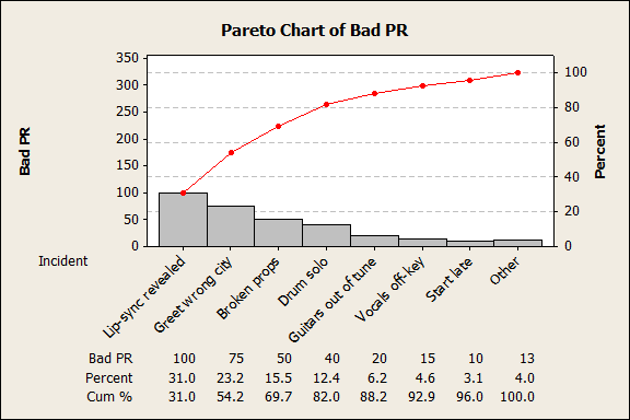
This is very important information for the PR manager, because it shows which types of incidents resulted in the biggest number of negative mentions.These results are quite different from the raw counts of defects. For example, even though it was the most frequent defect, the band starting late was barely mentioned in negative reports.
However, this is really just a different type of frequency data: in effect, we're counting the number of complaints rather than the raw number of defects.
There's another approach to getting more insight from a Pareto chart: we can look at the data in conjunction with another factor, like a cost, to create a weighted Pareto chart. Because the most common problems aren't always the most important ones, a weighted Pareto chart can give extra emphasis to the most important factors.
Setting Up Data for a Weighted Pareto Chart
A weighted Pareto chart doesn't just look at how often defects occur, but also considers how important they are. A weighted Pareto chart accounts for the severity of the defects, their cost, or almost anything else you want to track. And as we saw when we looked at bad PR instead of incident counts, a weighted Pareto chart may change how we see the priority for improvement projects.
Weighting requires a valuation: you weight the frequency counts by assigning attributes, such as cost, severity, or detectability, to each defect type. This attribute could be objective, such as the dollar amount it costs to fix each type of defect. For example, a garment manufacturer might know that wrinkles cost $.10 to fix, while dirt specks cost $.50.
Other attributes may be harder to quantify. For instance, a manufacturer might want to place a value on the potential effect of different defects on the company's reputation, a much more difficult thing to assess. Precise measures may not be available, but to get a sense of the possibilities, the manufacturer might ask a corporate counsel or communications officer to rate the damage potential of each type of defect on a scale, or even conduct a small survey to assign values.
In looking at the tour data for the Zero Sigmas, we'll assign a number from 1 to 100 for the amount of embarrassment, or "lameness," associated with each type of incident that took place, as shown below:
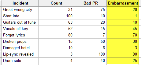
Now let's use these weights to create a weighted Pareto chart with Minitab Statistical Software. To do it, we'll first need to create a new column of data with Minitab's calculator (Calc > Calculator) by multiplying the degree of embarassment by the frequencies for each type of incident. We'll store that in a column titled "Lame-o."
Selecting Stat > Quality Tools > Pareto Chart and entering "Incidents" as the defects and "Lame-o" as the frequencies produces the following chart:
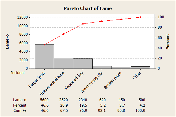
The weighted Pareto chart above uses the same incident count data, except that now the defects have been weighted by the degree of lameness involved in each type of incident. Here, you can see that Hy P. Value's forgetting the lyrics to his own songs accounted for 46% of the tour's lameness. Combine that with the guitarists' failure to tune their instruments and we've accounted for 67.5% of the total lameness from the last tour.
If the next Zero Sigmas tour is going to rock harder, we need to focus on tuning the instruments and making sure Hy P. Value remembers the words. Starting the show late may happen every night, but it doesn't even register in making the tour lame!
What Would You Like to Know?
All of this just goes to demonstrate that the same data can lead to different conclusions, depending on how we frame the question. If we're concerned with the frequency of defects, we focus on getting the band to start their shows on time. If we're concerned with minimizing bad PR, we want to make sure that Zero Sigmas don't get caught lip-syncing again. And if we want to make the band's next tour less lame, figuring out why the singer forgets the lyrics is where we'll want to start.
That's three ways the same data can give us three different insights into different aspects of quality. That's why we need to be careful about what we're actually measuring, and what we hope to achieve by measuring it.