


This is an exciting time for baseball fans, and as someone who gets equally excited about statistics, I can‘t think of a better time to analyze some baseball data! In this blog, I am going to distinguish two closely-related analyses that Minitab Statistical Software makes easy: Analysis of Variance (ANOVA) and Analysis of Means (ANOM). I will illustrate the difference between the two analyses by answering “which baseball parks are better for hitters and which parks are better for pitchers?”
My data is derived from ESPN's MLB Park Factors and it covers 2001 to today. First off, let me explain why this analysis requires some caveats:
- I apologize to fans of the White Sox, Cubs, and Athletics because I’ve omitted the parks for those teams. ESPN’s data doesn’t say which park is which in Chicago.
- There was only data for two years for the Athletics, even though they’ve been playing in the same stadium since the 60s.
- ESPN provides park factors for individual types of hits so we could use the data to determine the best park for singles, the best park for home runs, and so on. I’m going to use only the data based on the number of runs scored in each park.
side notes on the ANOVA and ANOM analysis
Before we dive in, here are some things to note: ANOVA and ANOM are analyses that use random samples from a population to generalize the sample results to a larger population. It is a stretch to imagine that the year-by-year data represent a random sample, so don’t take this analysis as serious inference. The results are still useful for showing the difference in the questions that the two different analyses answer.
Ready to boost your analytics skillset and take your data expertise to the next level?

The null hypothesis for an ANOVA analysis is that the means of the comparison groups are all equal to each other. An ANOVA analysis often includes multiple comparisons. Multiple comparisons look at the differences between means of groups to determine which means are statistically different and by how much.
The null hypothesis for ANOM is that all of the group means are equal to the mean of all of the data. If the null hypothesis for ANOM is true, then the null hypothesis of ANOVA is also true. It’s when we reject the null hypothesis that we find the difference in the analytical goals.
Ball park analysis #1 using one-way ANOVA
For the first analysis, I am going to use a one-way ANOVA test. We can go even deeper into this kind of analysis by choosing particular comparisons of interest. Here we are comparing all of the parks to the park where the fewest runs were scored: Petco Park.
Want to follow along? Here’s a Minitab 20.4 project with the data set that I analyzed. This dataset is special because I added the park factor rank before the park names. That addition means that when Minitab alphabetizes the park names in the results, the parks are in order from smallest park factor to largest park factor.
- Choose Stat > ANOVA > One-Way.
- In Response, enter Runs.
- In Factor, enter ‘Park Names’.
- Click Comparisons.
- Select Hsu MCB.
- In Best, choose Smallest is best.
- Click OK in each dialog.

The results above show which parks are better hitters’ parks than Petco Park. The list includes 19 parks, most notably Coors Field in Denver. The altitude in Denver is well-known for creating an environment that’s good for hitters.
This ANOVA information is very useful. We can see the parks that are better hitters’ parks than Petco Park and which parks are indistinguishable from Petco Park. If we did different sets of multiple comparisons, we could compare every park to every other park or every park to a single, chosen park. The differences between groups is the primary focus. With ANOM, we answer a different question. What if we want to classify parks as hitters' parks, neutral parks, and pitchers' parks?
The points on the graph are the mean park factors. The center line represents the overall mean. The outside lines are decision limits that show which parks are different from the overall mean.
Get a free trial of Minitab Statistical Software:

Ball park analysis #2 using anom
Recall that instead of testing whether means are equal to each other, ANOM tests whether the means are equal to the overall mean. Minitab makes a graph so that the results are easy to understand. You can follow these steps with the same dataset to get the results:
- Choose Stat > ANOVA > Analysis of Means.
- In Response, enter Runs.
- Under Normal in Factor 1, enter Park Names.
- Click OK.
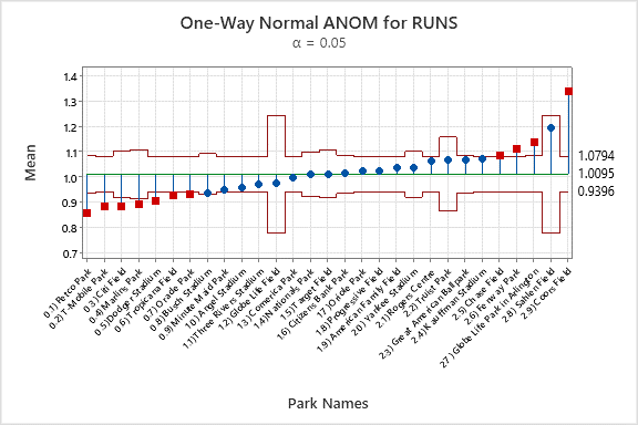 The points on the graph are the mean park factors. The center line represents the overall mean. The outside lines are decision limits that show which parks are different from the overall mean.
| This data contains 7 pitchers’ parks: | And 4 hitters’ parks: |
|
|
Statistical analysis improves decision making
Using an analysis that answers the right question for your application is key to making good decisions. Notice the differences between ANOVA and ANOM.
In the ANOVA analysis, we got two categories:
- Indistinguishable from Petco Park
- Better for hitters than Petco Park
For ANOM, we get three categories:
- Lower than the overall mean
- Indistinguishable from the overall mean
- Higher than the overall mean
Notice that there are also differences in the categorizations. In the ANOVA analysis, Busch Stadium is indistinguishable from Petco Park, so we would tend to think of it as a park that favors pitchers. In the ANOM analysis, Busch stadium is indistinguishable from the overall mean, so we would think of it as a neutral park with respect to runs. In the ANOVA analysis, we saw that 19 parks were better for hitters than Petco Park. In the ANOM analysis, we saw that 4 parks were better for hitters than the overall average.
For a deeper dive into the power of analytics, read this related blog:

The case of Sahlen Field in the ANOM is interesting. Sahlen Field has a mean that makes it look like a hitters’ park, but it’s not classified as a hitters' park statistically. The Toronto Blue Jays played games there in only two seasons. If these data were a random sample, we would see that the variation in the data is too high and the sample too small to provide statistical evidence that Sahlen Field would always be a hitters’ park. That relationship between the difference between the means and the variation within a group is an important benefit of using statistical analyses that consider the variation in the data.
Statistical analyses like ANOVA and ANOM provide the insight that we need to make better decisions from data - in this case, baseball parks. There are many ways you can leverage the results from comparing groups for better decision making in your own life, and in almost every role in every industry. To see another result of comparing groups, check out how Riverview Hospital Association identified specific patient groups that gave lower satisfaction scores than other groups so that the association could direct their improvement processes properly.