


We tend to think of control charts only for monitoring the stability of processes, but they can be helpful for analyzing a process before and after an improvement as well. Not only do control charts allow you to monitor your process for out-of-control data points, but you’ll be able to see how your process mean and variability change as a result of the improvement.
You might create separate before and after control charts for each phases of the improvement project, but making comparisons between those charts can be difficult. You could also try analyzing all of the data over the course of your project in a single control chart, but this could result in incorrectly flagging out-of-control points. This method also won’t calculate changing mean and control limit values.
Putting Control Charts on the Stage
The best choice in a case like this is to create a control chart in “stages,” which is easy to do with a statistical software package such as Minitab. Stages are used to create a historical control charts that shows how a process changes over specific time periods. At each stage, Minitab recalculates the center line and control limits on the charts.
Check out this simple example featuring a control chart that tracks admission times for a hospital’s ICU over a three-month period:
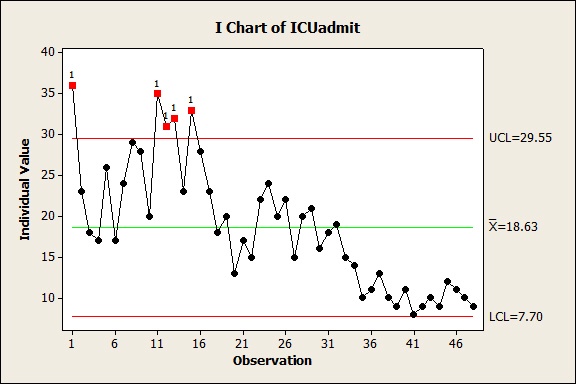
Though the process for admitting patients underwent improvement each month, all of the data is graphed on a single chart without utilizing stages.
It’s easy to see that the admission times decreased, but the only thing we really know for certain is that the mean admission time was about 18 minutes. Also, quite a few points at the outset suggest that this process is out of control.
Take a look at the exact same data, now charted with stages:
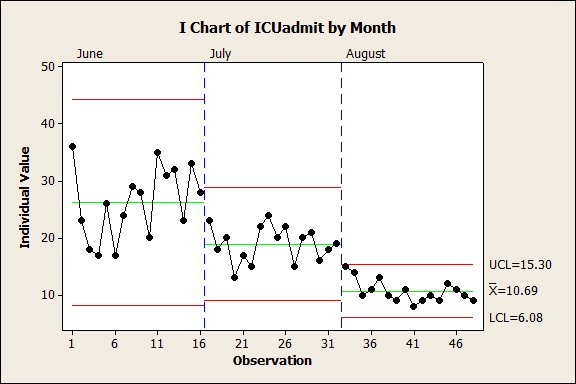
At each stage, Minitab recalculates the center line and control limits on the chart. Now it’s easy to see that this process was kept in control at every stage of improvement, and you also get a much more accurate idea of how the mean admission times went down at each stage of the improvement. You can also see that the variation of the process—the area between the upper and lower control limits—decreased over time.
To create a historical control chart with stages in Minitab, you’ll need a column of data indicating the stage of each observation. Here’s what that looks like for our ICU example:
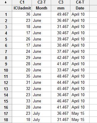
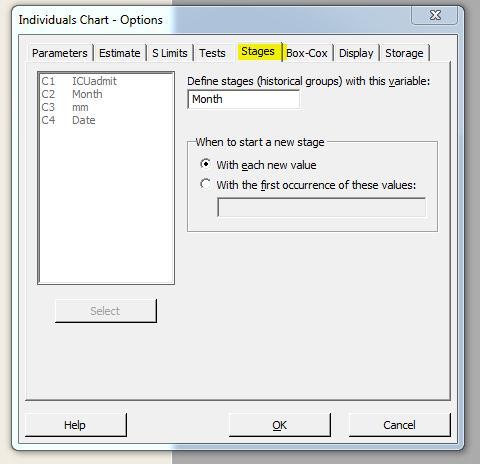
The column "month" contains the stages and the values June, July, and August correspond to each stage in the process. When you are creating the chart, just click the chart options button and click the stages tab. There you can enter the column containing the stages information. In this case, the column month contains the stages:
A special thanks to Patrick North in Minitab’s Information Development department for his contributions to this blog post!
For more on control charts, check of these posts:
Control Charts Show You Variation that Matters