


As a member of Minitab's Technical Support team, I get the opportunity to work with many people creating control charts. They know the importance of monitoring their processes with control charts, but many don’t realize that they themselves could play a vital role in improving the effectiveness of the control charts.
In this post I will show you how to take control of your charts by using Minitab Statistical Software to set the center line and control limits , which can make a control chart even more valuable.
When you add or change a value in the worksheet, by default the center line and control limits on a control chart are recalculated. This can be desirable in many cases—for example, when you have a new process. Once the process is stable, however, you may not want the center line and control limits continually recalculated.
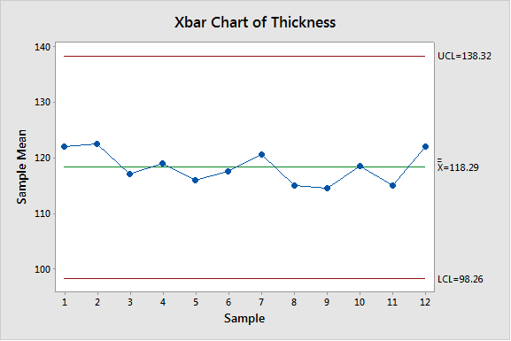
Consider this stable process:
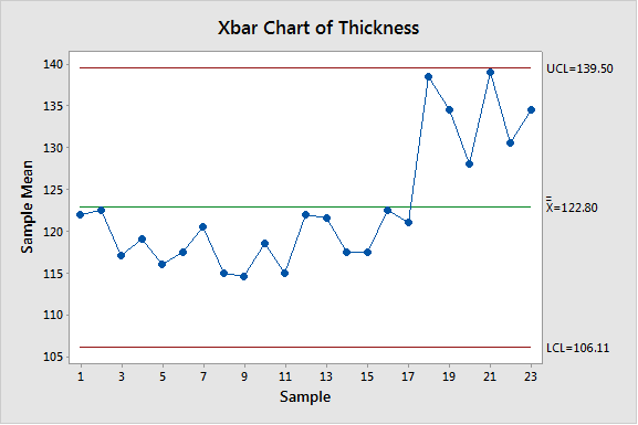
Now suppose the process has changed, but with the new re-calculated center line and control limits, the process is still shown to be in control (using the default Test 1: 1 point > 3 standard deviation from the center line).
If you have a stable control chart, and you do not want the center line or control limits to change (until you make a change to the process), you can set the center line and control limits. Here are two ways to do this.
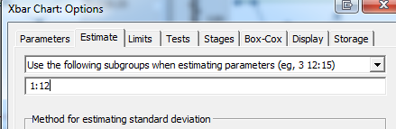
- Use the Estimate tab.
This option works well when you want to use the initial subgroups to calculate the center line and control limits.
- Choose Stat > Control Charts > Variables Charts for Subgroups > Xbar.
- Click the Estimate tab.
- Choose “Use the following subgroups when estimating parameters” and enter the appropriate number of subgroups. In the example above we want to use the first 12 subgroups, so enter 1:12.
- Use the Parameters tab.
This option works well when you do not have an initial set of data you want to use to calculate the center line and control limits, but know the values you want to use.
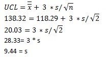
Suppose you want the center line of your Xbar chart to be 118.29, UCL=138.32 and LCL=98.26.
- Solve for the standard deviation, s. Using the formula for UCL, estimating
 for µ and s for
  :
:
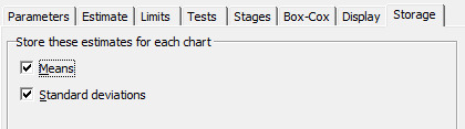
Note: If you want to use the estimates from another data set, such as a similar process, you could obtain the estimates of the mean and standard deviation without solving for s. Choose Stat > Control Charts > Variables Charts for Subgroups > Xbar. Choose Xbar Options, then click the Storage tab. Check Means and Standard deviations. I'll use the data from the first 12 subgroups above for illustration:
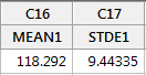
These values are stored in the next available blank columns in the worksheet.
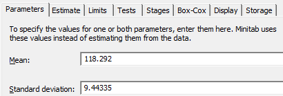
- Choose Stat > Control Charts > Variables Charts for Subgroups > Xbar. Choose Xbar Options, then click the Parameters tab. Enter the mean and standard deviation.
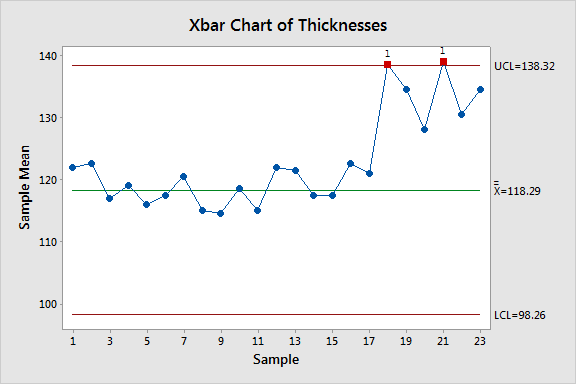
Using the center line and the control limits from the stable process (using either of the methods described above), the chart now reveals the new process is out of control.
As you can see, it's important to consider whether you are using the best center line and control limits for your control charts. Making sure you're using the best options, and setting the center line and control limits manually when desirable, will make your control charts even more beneficial.