


In several previous blogs, I have discussed the use of statistics for quality improvement in the service sector. Understandably, services account for a very large part of the economy. Lately, when meeting with several people from financial companies, I realized that one of the problems they faced was that they were collecting large amounts of "qualitative" data: types of product, customer profiles, different subsidiaries, several customer requirements, etc.
There are several ways to process such qualitative data. Qualitative data points may still be counted, and once they have been counted they may be quantitatively (numerically) analyzed using statistical methods.
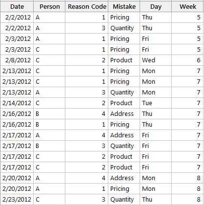
I will focus on the analysis of qualitative data using a simple and obvious example. In this case, we would like to analyze mistakes on invoices made during a period of several weeks by three employees (anonymously identified).
I will present three different ways to analyze such qualitative data (counts). In this post, I will cover:
- A very simple graphical approach based on bar charts to display counts (stacked and clustered bars), Pareto diagrams and Pie charts.
Then, in my next post, I will demonstrate:
- A more complex approach for testing statistical significance using a Chi-square test.
- An even more complex multivariate approach (using correspondence analysis).
Again, the main purpose of this example is to show several ways to analyze qualitative data. Quantitative data represent numeric values such as the number of grams, dollars, newtons, etc., whereas qualitative data may represent text values such as different colours, types of defects or different employees.
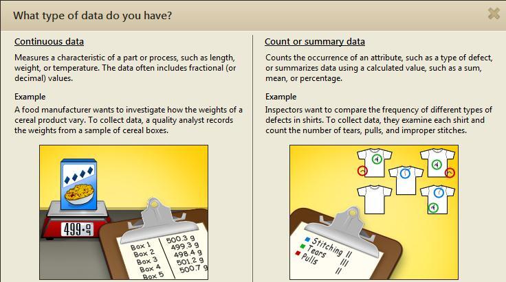
The Assistant in Minitab Statistical Software provides a great breakdown of two main data types:
Charts and Diagrams with Qualitative Data
I first created a pie chart using the Minitab Assistant (Assistant > Graphical Analysis) as well as a stacked bar chart on counts (from the graph menu of Minitab, select Graph > Bar Charts) to describe the proportion of each type of mistakes according to the day of the week.
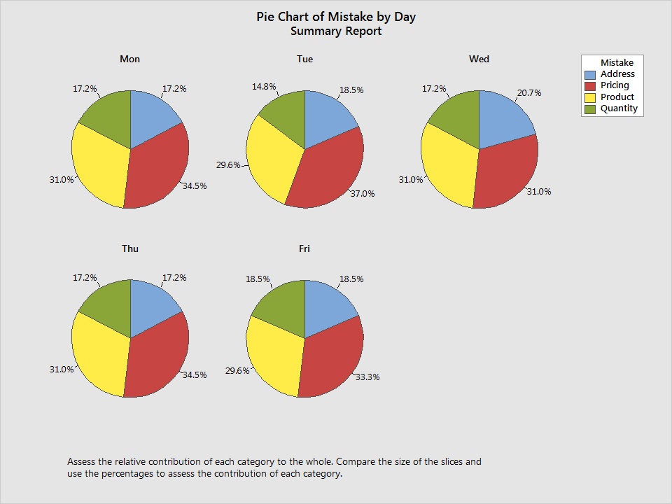
In the pie charts above, the proportion of mistake types seems to be fairly similar across the different days of the week.
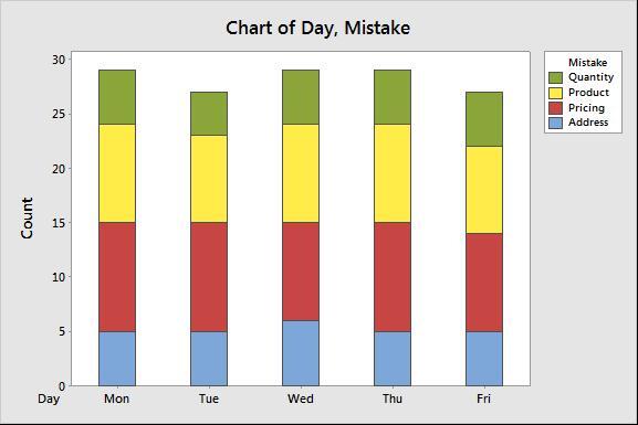
The number of mistakes also seems to be very stable and uniform according to day of week, when we see the stacked bar chart above.
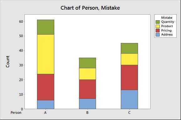
Now let's create a stacked bar chart on counts to analyze mistakes by employees. In this second graph, shown above, large variations in the number of errors do occur according to employees. The distribution of errors also seems to be very different, with more “Product” errors associated with employee A.
Qualitative Data in a Pareto Chart
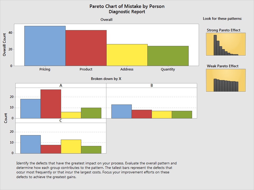
Above we see Pareto charts created using the Minitab Assistant (above): an overall Pareto and some additional Pareto diagrams, one for each employee. Again, it's easy to identify the large number of “product” mistakes (red columns) for employee A.
Stacked Bar Charts of Qualitative Data
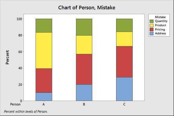
Mistake counts are represented as percentages in the stacked bar chart above. For each employee the error types are summed up to obtain 100% (within each employee's column). This provides a clearer understanding of how each employee's mistakes are distributed. Again, the high percentage of “Product” errors (in yellow) for employee A is very noticeable, but also note the high percentage, proportionately, of “Address” mistakes (blue areas) for employee C.
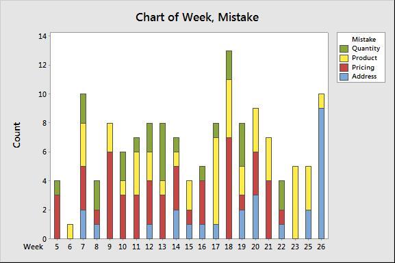
The stacked bar chart above displays changes in the number of errors and in error types according to the week (time trends). Notice that in the last three weeks, at the end of the period, only product and address issues occurred. Apparently error types tend to shift towards more “product” and “address” types of errors, at the end of the period.
Different Views of the Data Give a More Complete Picture
These diagrams do provide a clear picture of mistake occurrences according to employees, error types and weeks. However, as you've seen, it takes several graphs to provide a good understanding of the issue.
This is still a subjective approach though, several people seated around the same table looking at these same graphs, might interpret them differently and in some cases, this could result in endless discussions.
Therefore we would also like to use a more scientific and rigorous approach: the Chi-square test. We'll cover that in my next post.