


Rare events inherently occur in all kinds of processes. In hospitals, there are medication errors, infections, patient falls, ventilator-associated pneumonias, and other rare, adverse events that cause prolonged hospital stays and increase healthcare costs.
But rare events happen in many other contexts, too. Software developers may need to track errors in lines of programming code, or a quality practitioner may need to monitor a low-defect process in a high-yield manufacturing environment. Accidents that occur on the shop floor and aircraft engine failures are also rare events, ideally.
Whether you’re in healthcare, software development, manufacturing or some other industry, statistical process control is an important component of quality improvement. Using control charts, we can graph these rare events and monitor a process to determine if it’s stable or if it’s out of control and therefore unpredictable and in need of attention.
The G Chart
There are many different types of control charts available, but in the case of rare events, we can use Minitab Statistical Software and the G chart to assess the stability of our processes. The G chart, based on the geometric distribution, is a control chart designed specifically for monitoring rare events.
G charts are typically used to plot the number of days between rare events. They also can be used to plot the number of opportunities between rare events.
For example, suppose we want to monitor heart surgery complications. We can use a G chart to graph the number of successful surgeries that were performed in between the ones that involved complications.
The G chart is simple to create and use. To produce a G chart, all you need is either the dates on which the rare events occurred or the number of opportunities between occurrences.
Advantages of the G Chart
In addition to its simplicity, this control chart also offers greater statistical sensitivity for monitoring rare events than its traditional counterparts.
Because rare events occur at very low rates, traditional control charts like the P chart are typically not as effective at detecting changes in the event rates in a timely manner. Because the probability that a given event will occur is so low, considerably larger subgroup sizes are required to create a P chart and abide by the typical rules of thumb. In addition to the arduous task of collecting more data, this creates the unfortunate circumstance of having to wait longer to detect a shift in the process. Fortunately, G charts do not require large quantities of data to effectively detect a shift in a rare events process.
Another advantage of using the G chart to monitor your rare events is that it does not require that you collect and record data on the total number of opportunities, while P charts do.
For example, if you’re monitoring medication errors using a P chart, you must count the total number of medications administered to each and every patient in order to calculate and plot the proportion of medication errors. To create a G chart however, you just need to record the dates on which the medication errors occurred. Note the G chart does assume that the opportunities, or medications administered in this example, are reasonably constant.
Creating a G Chart
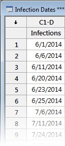
Each year, nosocomial (hospital-acquired) infections cause an exorbitant number of additional hospital days nationally, and, unfortunately, a considerable number of deaths. Suppose you work for a hospital and want to monitor these infections so you can promptly detect changes in your process and react appropriately if it goes out of control.
In Minitab, you first need to input the dates when each of the nosocomial infections occurred. Then to create a G chart and plot the elapsed time between infections, select Stat > Control Charts > Rare Event Charts > G.
In the dialog box, you can input either the 'Dates of events' or the 'Number of opportunities' between adverse events. In this case, we have the date when each infection occurred so we can use 'Dates of events' and specify the Infections column.
Interpreting a G Chart
Minitab plots the number of days between infections on the G chart. Points above the upper control limit (UCL) are desirable as they indicate an extended period of time between events. Points near or below the lower control limit (LCL) are undesirable and indicative of a shortened time period between events.
Minitab flags any points that extend beyond the control limits, or fail any other tests for special causes, in red.
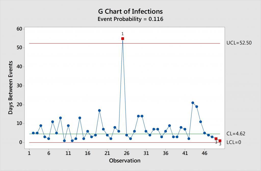
The G chart above shows that this hospital went nearly 2 months without an infection. Therefore, you should try to learn from this fortunate circumstance. However, you can also see that the number of days between events has recently started to decrease, meaning the infection rate is increasing, and the process is out of control. You should therefore investigate what is causing the recent series of infections.
Monitoring Rare Events with T Charts
While G charts are used to monitor the days or opportunities between rare events, you can use a T chart if your data are instead continuous.
For example, if you have recorded both the dates and time of day when rare events occurred, you can assess process stability using Stat > Control Charts > Rare Event Charts > T.
As more and more organizations embrace and realize the benefits of quality improvement, they will encounter the good problem of increased cases of rare events. As these events present themselves with greater frequency, practitioners across industries can rely on Minitab and the G and T charts to effectively monitor their processes and detect instability when it occurs.