


Histograms are great for summarizing several statistics. But whether you have enabled the Data Analysis Toolpak or you’re forging a path of formulas (COUNTIFs, AVERAGEs and STDEVs oh my!), creating a histogram in Excel isn’t always that great. We have developed Minitab Statistical Software to be your go-to histogram maker.
Let’s look at three ways you can do more with histograms in Minitab. For the first one, we will use an example on dishwasher spray arm reliability. You can download the data set from the Minitab Data Set Library if you’d like to follow along.

1. You need only two numbers for your bin range
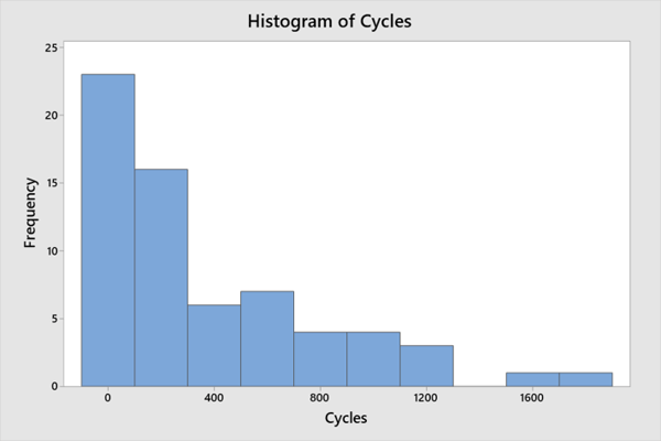
Bins are equally spaced intervals used to sort sample data. In histograms, they are shown as bars. Once you enter your data, Minitab follows an algorithm that makes a pretty good standard histogram. That doesn’t mean that you wouldn’t want to explore a little bit and see if small changes affect how the histogram looks. Here’s how a simple histogram of our dishwasher spray arm reliability data set displays:
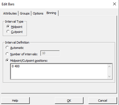
To easily redefine the bins:
- Double-click on the graph and the Edit Graph window will open.
- Double-click on one of the bars.
- Select Binning.
- Select Midpoint/Cutpoint positions.
- In Midpoint/Cutpoint positions enter 2 consecutive midpoints or enter values that define a single bin for your data. Click OK.
"Enter two values?" You might say "But I would prefer to have five bins on my graph!"
Minitab makes this easy. When you enter two values, Minitab expands the range of the bins to encompass the rest of your data. So if all you enter is two numbers …
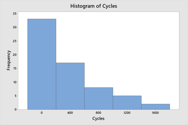
… then Minitab does the rest of the work for you:
Making the histogram in Excel is relatively easy, but with this data set the Y axis range is all cramped and the graph ends up being too small to be clear enough to read and understand.
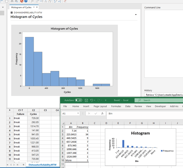
It would also not look as refined and you would run into a couple of bin range issues in addition to the bin range not being automatically handle for you.
- With unclear bin ranges, you can't be sure if they represent the same magnitude of distances, which would be critical for correctly evaluating the spread and shape of the data.
- Unless you have defined all of your bins, Excel sticks one on the end called “More” and lumps everything together. This “More” makes it impossible to judge how far apart the values are. Even if you change the largest value from 1740.75 to 999999999, you get the exact same histogram with the exact same bins.
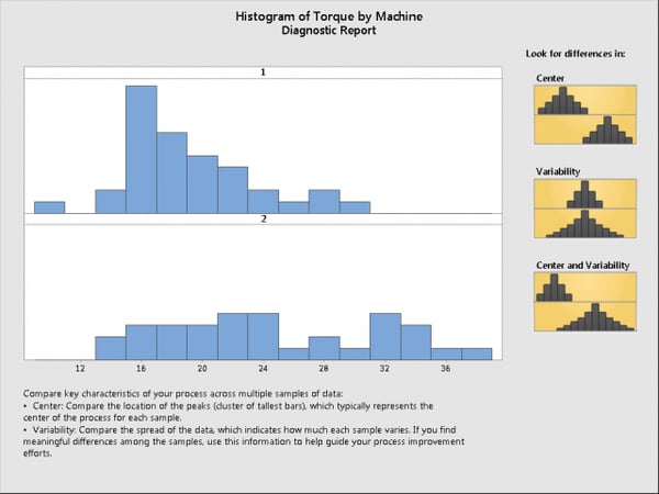
2. You can make histograms that are easy to compare using the Minitab Assistant
So now you know how easy histograms make it to analyze the features of a single sample of data. But did you know they're great for comparing samples too?
You can do it all with Minitab’s Assistant. We’ll use another data set from the library for this, Cap removal torque data. Download and open the Minitab file, then follow along with these instructions.
- Choose Assistant > Graphical Analysis
- Click Histogram
- In Y column, enter Torque.
- In X column, enter Machine. Click OK.
You just halved the number of steps you need to get histograms that are easy to compare. Not only are the histograms arranged in a way that makes comparisons easy, but the Assistant’s Diagnostic Report reminds you about some of the important differences you can see. Does the data have the same center? Does the data have the same variability? Do both the center and variability differ? In this case, it looks like the center and variability both vary between the groups.
It’s OK if you don’t have Minitab Statistical Software already!
Start your free 30-day trial right now
3. You can create histograms from tallied data.
Someday, someone is going to give you data that they've tallied instead of the nice single numeric column you're used to working with. Imagine, if you will, that it lands on your desk looking something like this:
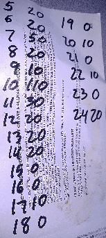
A lesser person might be intimidated as well as disgusted. That data has over 300 numbers in it. But not you. You're so good at Minitab that you know you don't have to type over 300 numbers. You can use that data just the way it is. First, enter the data into Minitab:
|
Length of Stay |
Frequency |
|
5 |
20 |
|
6 |
20 |
|
7 |
50 |
|
8 |
20 |
|
9 |
10 |
|
10 |
110 |
|
11 |
30 |
|
12 |
20 |
|
13 |
20 |
|
14 |
20 |
|
15 |
0 |
|
16 |
0 |
|
17 |
10 |
|
18 |
0 |
|
19 |
0 |
|
20 |
10 |
|
21 |
0 |
|
22 |
10 |
|
23 |
0 |
|
24 |
20 |
Then, follow these steps:
- Choose Graph > Histogram
- Choose Simple. Click OK.
- In Graph variables, enter Length of Stay.
- Click Data Options.
- Click Frequency.
- In Frequency variable, enter Frequency.
- Click OK twice.
You get this histogram:

And remember, if you want to change the bins around, you can use just two numbers and Minitab takes care of the rest!
Wrapping Up
Whether you want to quickly explore different bins, make comparisons between histograms, or make a histogram from a tally, Minitab makes it fast and easy. Histograms are full of the information that you need to make good decisions about how to improve your processes. Now you know how to get even more out of histograms in Minitab.