


I saw a really interesting conversation in a LinkedIn group recently. This group of statistics and data analytics consultants has been discussing how causation and correlation can be very field-dependent. For instance, evidence supporting causation might be very different if we're looking at data from a clinical trial conducted under controlled conditions as opposed to observational economic data.
Contributors also have been citing some pretty fascinating ideas and approaches, including the application of Granger Causality to time series data; Hill's Causation Criteria in epidemiology and other medical-related fields; and even a very compelling paper which posits that most published research findings are false.
All of this is great food for thought, but it underscores again what must be the most common misunderstanding in the statistical world: correlation does not equal causation. This seems like a simple enough idea, but how often do we see the media breathlessly reporting on a study that has found an associative relationship between some factor (like eating potato chips) and a response (like having a heart attack) as if it established direct, a + b = c inevitability?
What Is Correlation?
Correlation is just a linear association between two variables, meaning that as one variable rises or falls, the other variable rises or falls as well. This association may be positive, in which case both variables consistently rise, or negative, in which case one variable consistently decreases as the other rises.
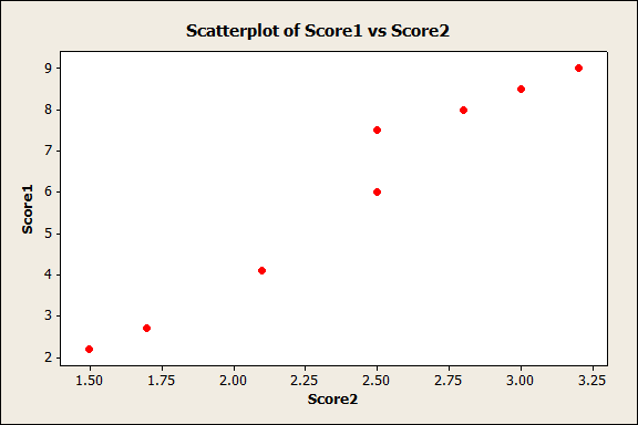
An easy way to see if two variables might be correlated is to create a scatterplot. Sometimes a scatterplot will immediately indicate correlation exists; for instance, in this data set, if we choose Graph > Scatterplot > Simple, and enter Score1 and Score2, Minitab creates the following graph:
(If you want to play along in Minitab and you don't already have it, start your free 30-day trial today!)
In this scatterplot above, we can clearly see that as score1 values rise, so do the values for Score2. There's definitely correlation there! But sometimes a scatterplot isn't so clear. From the same data set, let's create a scatterplot using "Verbal" as the X variable and GPA as the Y variable:
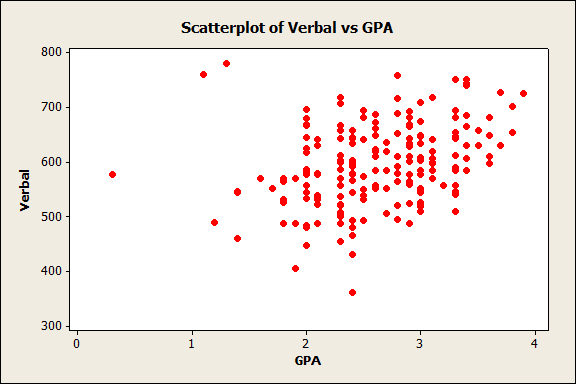
Well, it looks like there might be a correlation there...but there's a lot of scatter in that data, so it isn't so clear as it was in the first graph. Is it worth exploring this further (for instance, by proceeding to a regression analysis to learn more about the association)? Fortunately, we can look at a statistic that tells us more about the strength of an association between these variables.
The Correlation Coefficient
The correlation coefficient can range in value from -1 to +1, and tells you two things about the linear association between two variables:
- Strength - The larger the absolute value of the coefficient, the stronger the linear relationship between the variables. An value of one indicates a perfect linear relationship (the variables in the first scatterplot had a correlation coefficient of 0.978), and a value of zero indicates the complete absence of a linear relationship.
- Direction - The sign of the coefficient indicates the direction of the relationship. If both variables tend to increase or decrease together, the coefficient is positive. If one variable tends to increase as the other decreases, it's negative.
To find the Pearson correlation coefficient for these two variables in Minitab, go to Stat > Basic Statistics > Correlation... and enter Verbal and GPA in the dialog box. Minitab provides the following output:
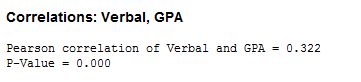
The correlation coefficient for Verbal and GPA in our data set is 0.322, indicating that there is a positive association between the two. Comparing the 0.978 of the first two variables to this, we see the variability visible in the second scatterplot reflected in the lower correlation coefficient: there's a relationship there, but it is not as obvious or clear.
So, does the connection between Verbal and GPA merit further scrutiny? Maybe...with real data sets, it's rare to see a correlation coefficient as high as that between Score1 and Score2. Whether you should interpret an intermediate value for the Pearson correlation coefficient as a weak, moderate, or strong correlation depends on your objectives and requirements.
Even STRONG Correlation Still Does Not Imply Causation
But even if your data have a correlation coefficient of +1 or -1, it is important to note that correlation still does not imply causality. For instance, a scatterplot of popsicle sales and skateboard accidents in a neighborhood may look like a straight line and give you a correlation coefficient of 0.9999...but buying popsicles clearly doesn't cause skateboard accidents. However, more people ride skateboards and more people buy popsicles in hot weather, which is the reason these two factors are correlated.
It is also important to note that the correlation coefficient only measures linear relationships. A meaningful nonlinear relationship may exist even if the correlation coefficient is 0.
Only properly controlled experiments help you to determine whether a relationship is causal, and as that recent LinkedIn conversation has indicated, the "requirements" for determining causality can vary greatly depending on what you're studying.
So, in the end, what can we say about the relationship between correlation and causation? This comic, also referenced in the recent LinkedIn conversation, sums it up nicely:
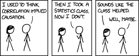
Comic licensed under a Creative Commons Attribution-NonCommercial 2.5 license.
Photo credit to robin_24. This photo has a creative commons attribute license.