


Here are seven quality improvement tools I see in action again and again. Most of these quality tools have been around for a while, but that certainly doesn’t take away any of their worth!
The best part about these tools is that they are very simple to use and work with quickly in Minitab Statistical Software or Engage, but of course you can use other methods, or even pen and paper.
1. Fishbone Diagram
Fishbones, or cause-and-effect diagrams, help you brainstorm potential causes of a problem and see relationships among potential causes. The fishbone below identifies the potential causes of delayed lab results:
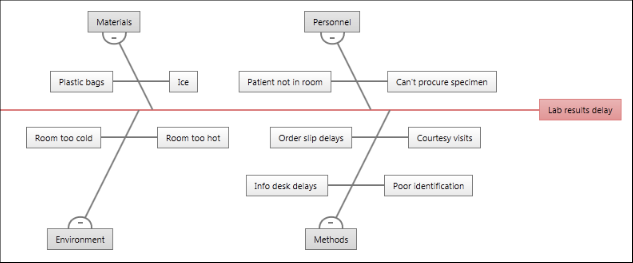
On a fishbone diagram, the central problem, or effect, is on the far right. Affinities, which are categories of causes, branch from the spine of the central effect. The brainstormed causes branch from the affinities.
2. Control Chart
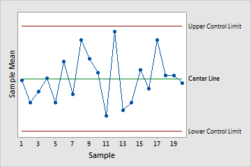
Control charts are used to monitor the stability of processes, and can turn time-ordered data for a particular characteristic—such as product weight or hold time at a call center—into a picture that is easy to understand. These charts indicate when there are points out of control or unusual shifts in a process.
(My colleague has gone into further detail about the different types of control charts in another post.)
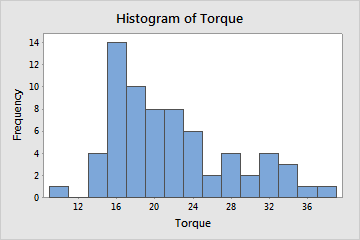
3. Histogram
You can use a histogram to evaluate the shape and central tendency of your data, and to assess whether or not your data follow a specific distribution such as the normal distribution.
Bars represent the number of observations falling within consecutive intervals. Because each bar represents many observations, a histogram is most useful when you have a large amount of data.
4. Process Map
A process map, sometimes called a flow chart, can be used to help you model your process and understand and communicate all activities in the process, the relationships between inputs and outputs in the process, and key decision points.
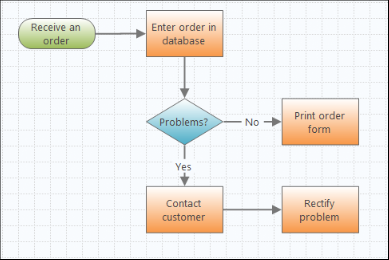
Engage makes it easy to construct high-level or detailed flow charts, and there’s also functionality to assign variables to each shape and then share them with other tools you’re using in Engage.
5. Pareto Chart
Pareto charts can help you prioritize quality problems and separate the “vital few” problems from the “trivial many” by plotting the frequencies and corresponding percentages of a categorical variable, which shows you where to focus your efforts and resources.
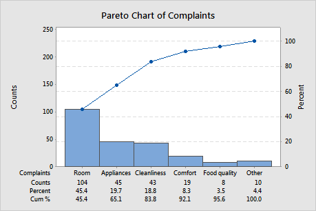
For a quick and fun example, download the free trial version of Minitab (if you don’t have it already), and follow along with Pareto Power! or Explaining Quality Statistics So Your Boss Will Understand: Pareto Charts.
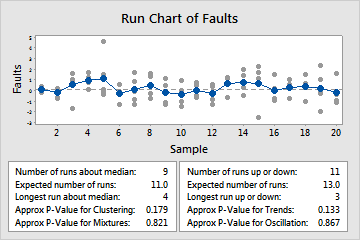
6. Run Chart
You can use a run chart to display how your process data changes over time, which can reveal evidence of special cause variation that creates recognizable patterns.
Minitab's run chart plots individual observations in the order they were collected, and draws a horizontal reference line at the median. Minitab also performs two tests that provide information on non-random variation due to trends, oscillation, mixtures, and clustering -- patterns that suggest the variation observed is due to special causes.
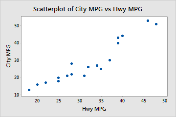
7. Scatter Plot
You can use a scatter plot to illustrate the relationship between two variables by plotting one against the other. Scatterplots are also useful for plotting a variable over time.
What quality tools do you keep in your back pocket?