


All processes have some variation. Some variation is natural and nothing to be concerned about. But in other cases, there is unusual variation that may need attention.
By graphing process data against an upper and a lower control limit, control charts help us distinguish natural variation from special cause variation that we need to be concerned about. If a data point falls outside the limits on the control chart, the process is out of control, and you need to investigate.
Simple, right?
False Alarms with Traditional Control Charts
But most people who’ve worked extensively with control charts, particularly attributes charts, can tell you about “false alarms” where the control limits fell close to the mean and data points exceeded the limits even though the process was in statistical control.
The problem of false alarms on traditional P and U control charts due to overdispersion has been known for decades, but a good solution didn’t exist until quality engineer David Laney devised P' and U' charts.
Using P' and U' control charts enables you to avoid these false alarms so only important deviations in your process are detected. Like traditional P and U charts, we use P' and U' charts to monitor defectives and defects, respectively. But where traditional charts assume your defective or defect rate remains constant over time, P' and U' charts assume that no process exhibits a truly constant rate, and factors that into its control limits.
As a result, these charts can give you a more reliable indication of whether your process is truly in or out of control.
Minitab makes it easy to create P' and U' charts, and includes a diagnostic tool that tells you when you need to use them, so you can be confident in detecting special-cause variation only when it truly exists.
What Causes False Alarms on a Control Chart?
False alarms can be caused by too much variation in process data, or “overdispersion,” especially if you collected your data using large subgroups. The larger your subgroups, the narrower your control limits will be on a traditional P or U chart. This situation creates artificially tight control limits, causing points on a traditional P chart to look like they’re out of control even when they are not.
Alternatively, too little variation, or “underdispersion,” can also be problematic. When underdispersion exists, control limits on a traditional P chart or U chart may be too wide, so data points (or “processes”) you should be concerned about appear to be in control.
Whether your data exhibit overdispersion or underdispersion, a P' or U' chart will help you distinguish true common cause versus special cause variation.
How to Detect Overdispersion and Underdispersion
Use the P Chart or U Chart Diagnostic in Minitab to test your process data for overdispersion and underdispersion, and to see whether a traditional P or U chart or a Laney P' or U' chart is more appropriate.
To run a diagnostic on your data, choose Stat > Control Charts > Attributes Charts > P Chart Diagnostic or Stat > Control Charts > Attributes Charts > U Chart Diagnostic.
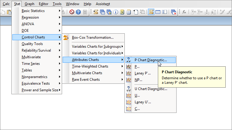
You’ll see the following dialog box:
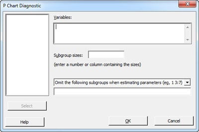
In Variables, enter the worksheet column that contains the number of defectives. If you collected all of your samples using the same subgroup size, enter that number in Subgroup sizes. Or if your subgroup sizes varied, use a column.
Let’s run this diagnostic test on the DefectiveRecords.MTW sample data included in Minitab. The subgroups in this data set are large, with an average of about 2,500 observations in each.
The P chart diagnostic gives the following output:
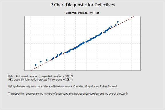
The diagnostic gives you the ratio of observed to expected variation. If the ratio is greater than the 95% upper limit, your data exhibit significant overdispersion. If the ratio is less than 60%, your data exhibit significant underdispersion. In either case, you should consider using a Laney P' chart instead of a traditional P chart.
The test found overdispersion in our sample data and recommends that we use a Laney P' chart instead.
How to Create a P' Chart
To create a P' chart, choose Stat > Control Charts >Attributes Charts > Laney P'. The P' chart for our sample data shows that the process appears to be stable—no points are out of control:
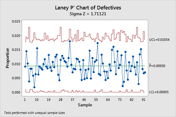
When we use the same data to create a traditional P chart, overdispersion results in narrower control limits, and several of the subgroups appear to be out of control.
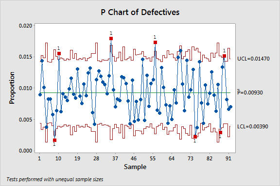
So why do the data points seem to be out of control on the P chart, but not the P' chart? It’s due to the way each chart defines and calculates the variation in your process. The limits calculated in the Laney P' account for the overdispersion when calculating the variation and eliminate these false alarms.
How Does the P' Chart Work?
The calculations for the Laney P' chart include not only within-subgroup variation, but also the variation between subgroups to adjust for overdispersion or underdispersion.
If there’s no problem with over- or underdispersion, the P' chart is comparable to a traditional P chart. But when overdispersion exists, the P' chart expands the control limits so only important deviations are identified as out of control. If underdispersion exists, the P' chart calculates narrower control limits.
More Reliable Control Charts
Quality practitioners across all industries can take advantage of Laney's powerful charts and the easy-to-use diagnostic tool and be confident in detecting special-cause variation only when it truly exists.
Read On the Charts: A Conversation with David Laney to learn more about the statistical foundation behind them.