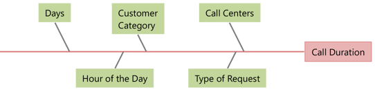
 Trying to solve a complex problem? You should begin by listing all suspected variables. Then, identify the few critical factors and separate them from the others that are not essential to understanding the cause. Let’s take a look at a very simple graphical tool that is very intuitive, can be used by virtually anyone, and does not require any prior statistical knowledge: the Variability Chart.
What Is a Variability Chart?
Variability Charts are a great way of presenting analysis of variance (ANOVA) data visually and they excel in the early stages of root cause analysis. Their main strength is in enabling you to visualize many diverse sources of variations in a single diagram while providing an overall view of the factor effects.
Variability Charts can help you carry out an investigation and study patterns of variation from many possible causes on a single chart. They allow you to display positional or cyclical variations in processes. They can also be used to study variations within a subgroup, between subgroups, etc.
To create a Variability Chart in Minitab Statistical Software, choose Stat > Quality Tools > Variability Chart... Then select your response variable and up to eight factors in the dialog box.
Get an Overview and More In-Depth Information
Visualizing Call Center Wait Times with Variability Charts
Suppose you need to examine wait times from several call centers that are part of a large financial services company. Customers and potential customers call to open new accounts, get information about credit cards, ask for technical support and access other services. You have data about customer categories, types of service (requests), and the wait time in seconds to answer each phone call (duration). You can use Variability Charts to analyze the wait times.
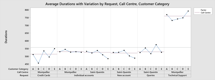
Take a look at the Variability Chart above. Call centers, customer categories, wait times and types of requests are all displayed. Each call center has been dedicated to specific types of requests. For example, technical support calls are only processed at the Montpellier call center.
Want to Follow Along in Minitab?

(It's OK if you don't already have Minitab!)

Notice at the top right how duration is longest at the Montpellier call center? If you take a look at the other graphs in the Minitab project, you can see the days and hours as well. They suggest that waiting times are longest on Mondays in Montpellier and they generally tend to be longer in Montpellier than in Saint-Quentin every day. Wait times are much longer for technical support requests on Mondays as well.
However, note that when there is no obvious dominant factor, or when the “signals” from the process are too “weak” to be detected easily, it is useful to augment the Variability Chart with more powerful statistical techniques (such as ANOVA or a regression analysis) to numerically estimate the effects due to each factor.
Next Steps After the Variability Chart
Thanks to the the excellent visual display of the variation components in the Variability Chart, the financial services company was easily able to see that technical support calls and Mondays were the main and obvious issues. Now the company can take the next step and begin to investigate why those issues exist and how to fix them.
Walk Through 2 More Industry Uses for Variability Charts