


Statistically Speaking, This Is the Worst Day to Travel This Summer
Planning summer vacation? Discover the worst travel day of summer 2025 based on TSA data, airport trends, and flight delays. Avoid peak chaos and travel smarter with data-driven tips.
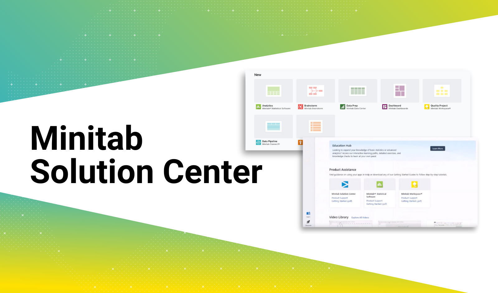
Spreadsheet to Simulation: Build in Minutes Using Data You Already Have
Build a simulation from data you already have. No blank screens, no manual mapping, just upload your table and start improving your process.
How One Hotel Used Data to Improve Guest Satisfaction
Learn how one hotel used regression analysis and guest feedback data to uncover a hidden comfort issue and boost satisfaction scores using Minitab Solution Center.
Solving Seasonal Packaging Defects with the Power of Data and AI
A food and beverage manufacturer used Minitab’s AI, statistical tools, and real-time monitoring to identify and resolve seasonal packaging defects with confidence.
How to Use DOE to Uncover Hidden Allergens Faster with Minitab Quick Designs
Learn how Minitab’s Quick Designs streamline DOE to uncover hidden allergens faster. Ideal for beginners needing smart, efficient experiment setups.
Wafer Plots for Better Yields
Now available in Minitab Graph Builder: The Wafer Plot helps semiconductor engineers visualize chip-level defects with spatial precision, enabling faster root cause analysis and proactive yield improvement.
5 Ways to Use Simulation to Navigate Tariff Challenges and Uncertainty
Use simulation to navigate trade uncertainty and make smarter, faster manufacturing decisions.
I’m a Shape, I’m a Shape, I’m a Very Lovely Workspace Shape…
Explore the new shapes in Minitab Workspace for powerful diagramming tools for quality, IT, healthcare, and more—perfect for solving problems and mapping success.
Gardening Blog #2: Minitab Workspace: A Powerful Tool for Project Documentation and Planning
Minitab Workspace is an improvement-project management software designed to help plan, execute, and report on CI, OPEX, Six Sigma improvement projects.
Top 3 Problems Costing Your Fleet Millions—and How to Solve Them
Discover how to eliminate inefficiencies in fleet operations using Minitab’s data-driven tools to boost fuel efficiency, reduce delays, and optimize resource use.