Last month we published a blog post on 5 Tips for Handling Messy Data. Last week we presented a webinar, Tips & Tricks for Minitab. When I saw feedback on LinkedIn from “extremely informative and enjoyable” to noting the importance of “looking for opportunities for continuous learning,” I’m reassured you all want more!
So I have combed our Minitab Blog archives and asked some of my expert colleagues for some more tips we can expand on. Here are some more tips and tricks to help your Minitab analyses. Stick around to the end, too, for some other learning opportunities!
Update graphs when your data changes
When you change data in your worksheet, most graphs in Minitab will show a notification in your output pane where you can click to update your graph or create a new graph based on your changes:

Would you rather have your graphs update automatically? Click the flyout menu at the top right of your output pane ![]() and you’ll see an option you can select, Update Results Automatically. Note that this is how updating the graph works starting with Minitab 19. In earlier versions the top-left corner of the graph would show a yellow warning triangle and circular blue arrows icon that you could right-click and select Update Graph Now.
and you’ll see an option you can select, Update Results Automatically. Note that this is how updating the graph works starting with Minitab 19. In earlier versions the top-left corner of the graph would show a yellow warning triangle and circular blue arrows icon that you could right-click and select Update Graph Now.
Quickly make a similar graph
If you double-click on any graph in Minitab, you can bring up the graph editor and change colors on the graph and the background, change labels, add reference lines and make numerous other updates to the look and feel of the graph. Sometimes you’ll need to make the same edits to multiple graphs for different measurements. That can be tedious and time-consuming.
Thankfully you can leverage the Make Similar Graph function. Right-click on the graph to open up the Context Menu and you’ll see the option for Make Similar Graph. Then you can choose different variables to make a new graph with the same colors, fonts, etc.
Got information overload? Split the worksheets
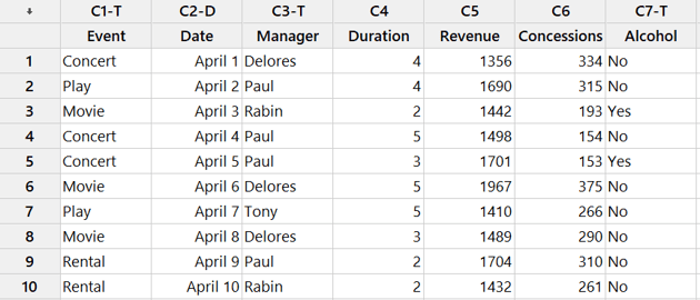
Sometimes you receive data sets with more information than you need. Take this data above about different types of events that take place at a local theater.
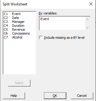
With each type of event jammed into a single worksheet, it's a challenge to analyze just one event category. Go to Data > Split Worksheet... and double-click the Event column as shown below, then click OK.
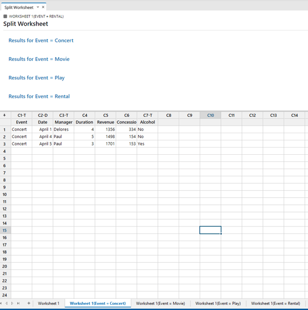
Minitab will create new worksheets that include only the data for each type of event:
If you need to do the opposite – combine data split up among several worksheets into one – Minitab also has the option Data > Merge Worksheets.
Locations written as numbers rather than by name? Make it readable with recode
Many problems with data don't become obvious until you begin to analyze them. A shortcut or abbreviation that worked well when the data was being collected might turn out to be a time-waster in the end. Recently we showed how to recode data using a conversion table. Now let’s look at recoding “numeric” data that we actually want to be text.
Say someone collected data for a company using numbers to represent both the locations and units:
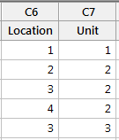
That might have been a convenient way to record the data, but unless you have memorized what each set of numbers stands for, interpreting the results of your analysis will be a confusing chore.
To fix this, start with Data > Recode > To Text... and complete the dialog box like this:
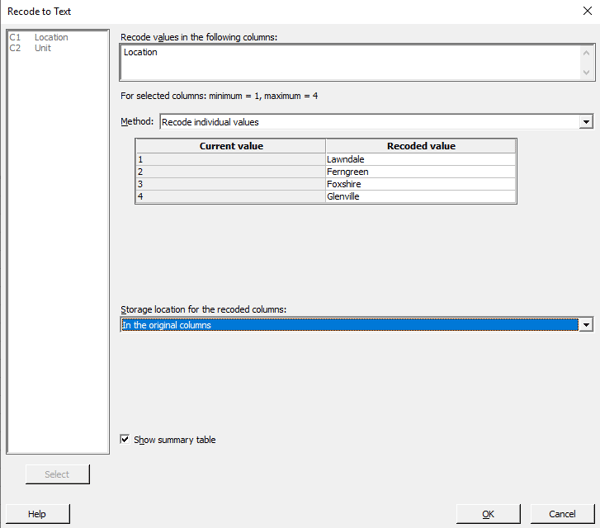
You can choose to overwrite the data in the original column as I do here or store it elsewhere in the worksheet, or in a new worksheet. Check “Show Summary Table” if you want to see what was changed in the Navigator:
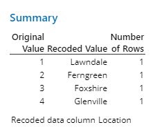
Click OK and you now your data has labels that anyone can understand. When you create graphs and figures, they will be clearly labeled.
Drag down and autofill
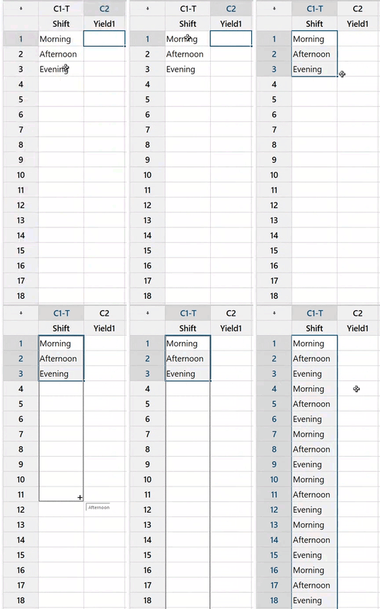
Let’s say you are recording data for three shifts. You don’t need to manually type in Morning, Afternoon and Evening over and over again. You don’t even need to copy and paste it. Highlight the cells you want to copy and then hover over the bottom-right corner until the cursor turns into a +, and then drag down for as many cells as you want to copy the series to.
If you have numeric column with a pattern that Minitab recognizes (e.g. going up by 3 – 3, 6, 9), you can use the same method to autofill for as long as you like – if you highlight the 3, 6 and 9 and drag down it will continue with 12, 15, 18, etc. for as long as you like.
…or make patterned data
While dragging down to generate data is great, you might be looking for the precision of a dialog box so you don’t accidentally drag and scroll all the way down to row 100,000 or so. Select Calc > Make Patterned Data to fill out your worksheet with a sequence of numbers, text data or date/time data (learn more).
Wrapping up, and watching these tips in action
Hopefully some of these quick tips can help you manipulate data, run analyses and create visualizations faster in Minitab. And if you haven’t watched the Tips & Tricks for Minitab Statistical Software webinar already, I highly recommend you follow the link in the image below. From some of the tips here (a primer on Recode at 09:15, more on Patterned Data at 12:50, updating graph results at 17:20, Make Similar Graph at 31:15) to more than a dozen others, we’ve broken down where you can find every tip and hear more about it.


